PROJECT 2 - BUSINESS CARD
Project Overview
This project was focused on building a cohesive stationery system and business card design that reflects a bold, handcrafted brand identity. The goal was to combine classic design influences with a modern edge using custom typography, symbolic shapes, and a rich color palette.
This project was focused on building a cohesive stationery system and business card design that reflects a bold, handcrafted brand identity. The goal was to combine classic design influences with a modern edge using custom typography, symbolic shapes, and a rich color palette.
Concept & Inspiration
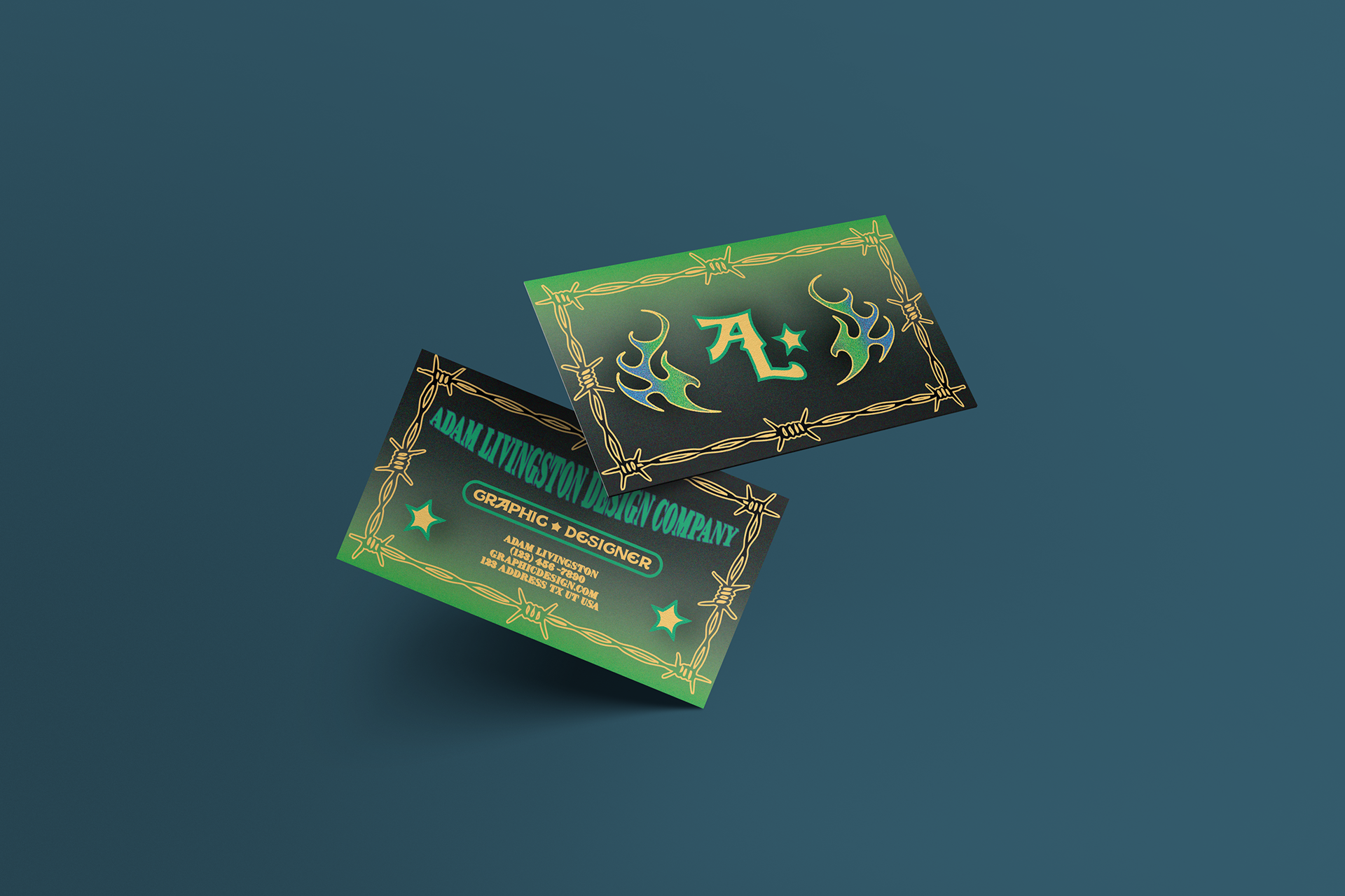
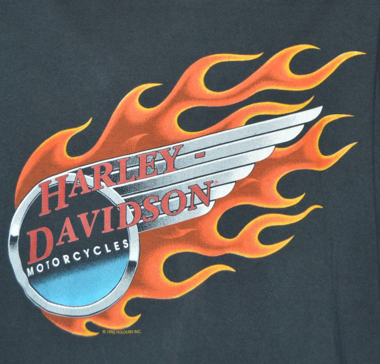
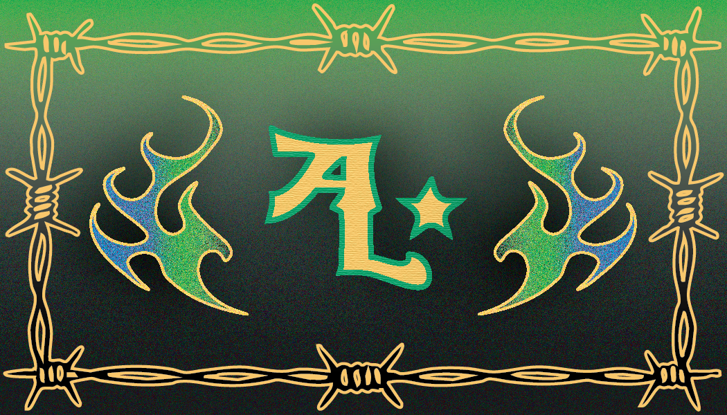
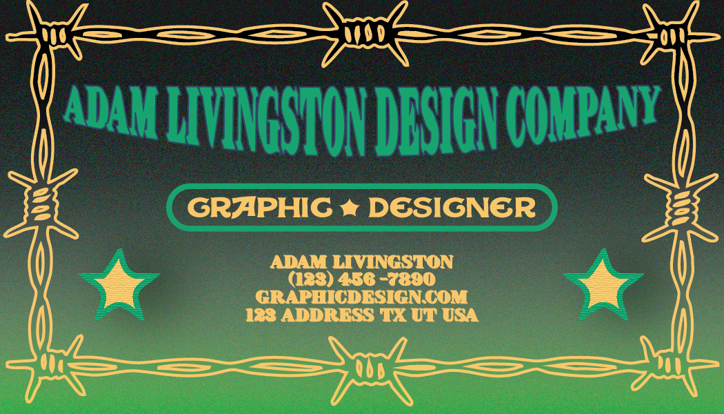
The design pulls inspiration from vintage biker logos and old-school sign painting styles. I wanted the brand to feel strong, confident, and a little rebellious — while still maintaining clarity and professionalism. The barbed-wire border, flame motifs, and moon/star symbols add personality and motion to the layout.


Color Exploration
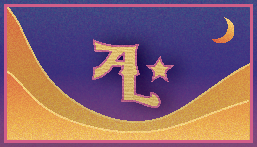
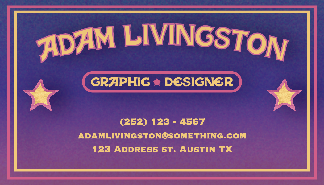
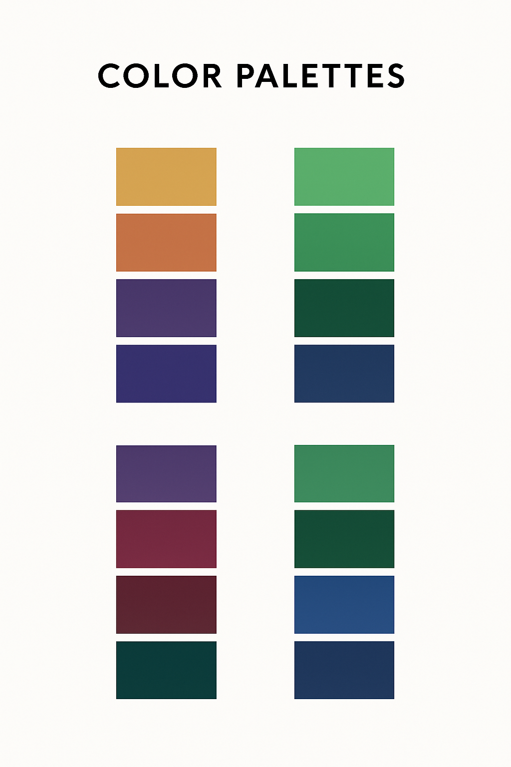
I explored multiple color palettes, from warm retro tones to dark neon greens and blues. Each palette shifted the overall personality of the design, helping me refine the brand’s direction.
Final Design
The final version uses a green and gold palette that balances energy and refinement.
Honorable mention, my second choice: