
Identity System
Branding, print design, packaging, and client stationery
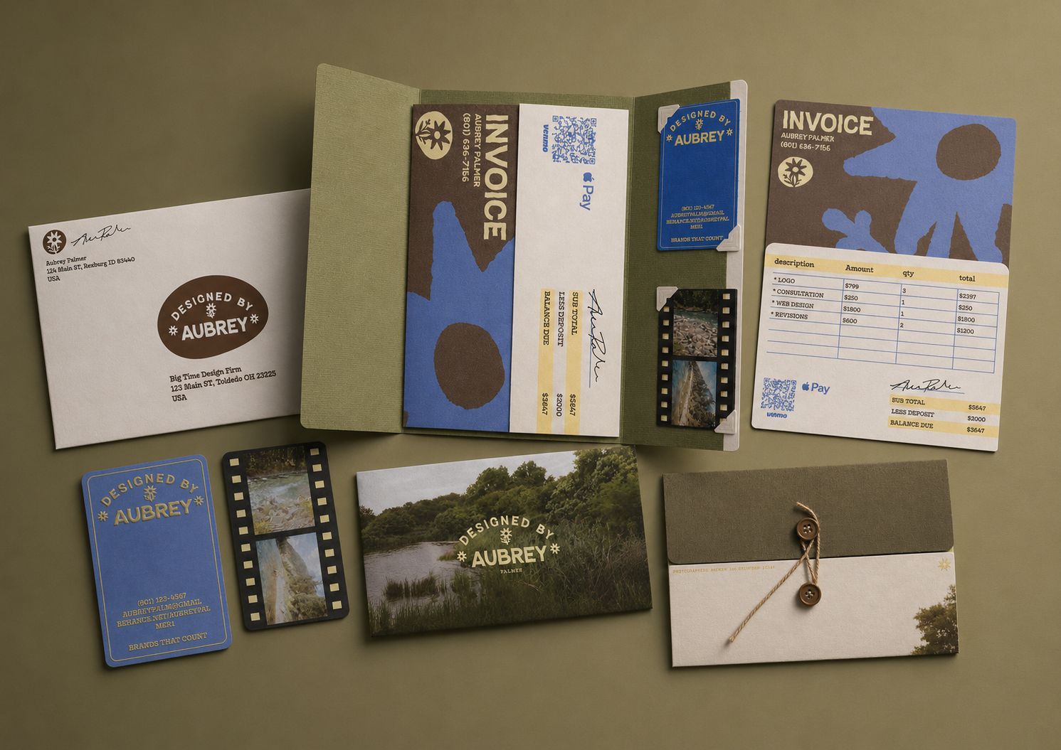
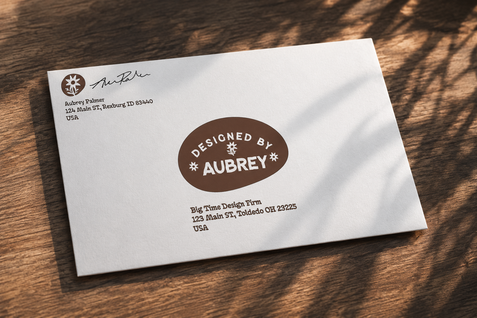
For my classmate, Aubrey Palmer, I created a photography and design identity system built around organic textures, soft natural imagery, fluid typography, and tactile print materials. The goal was to create a brand package that feels personal, warm, and crafted rather than overly polished or corporate.
Brand Concept & Mood
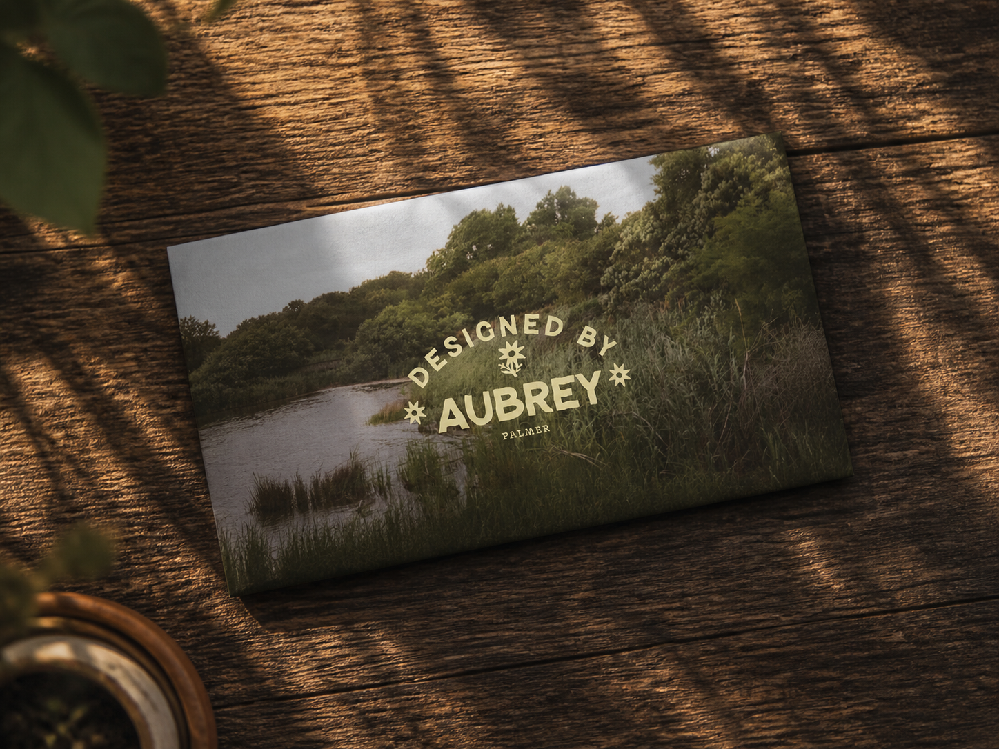
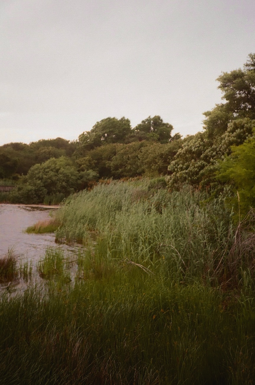
The visual direction was inspired by Aubreys actual film photography. Inspiration was also drawn from field notes, handmade mailers, and natural textures. I wanted the brand to feel like something you would receive from an artist, not a company.



Logo & Design System
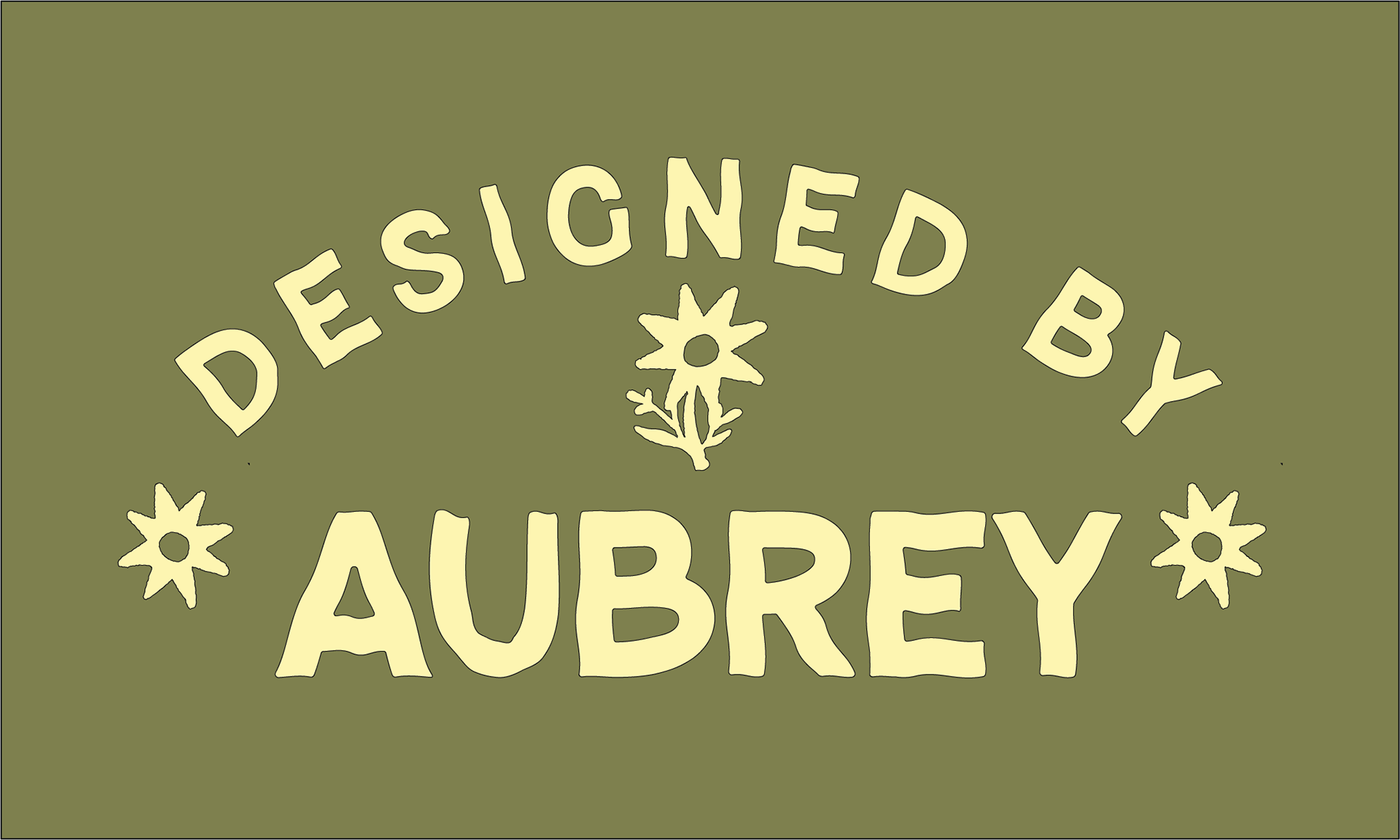
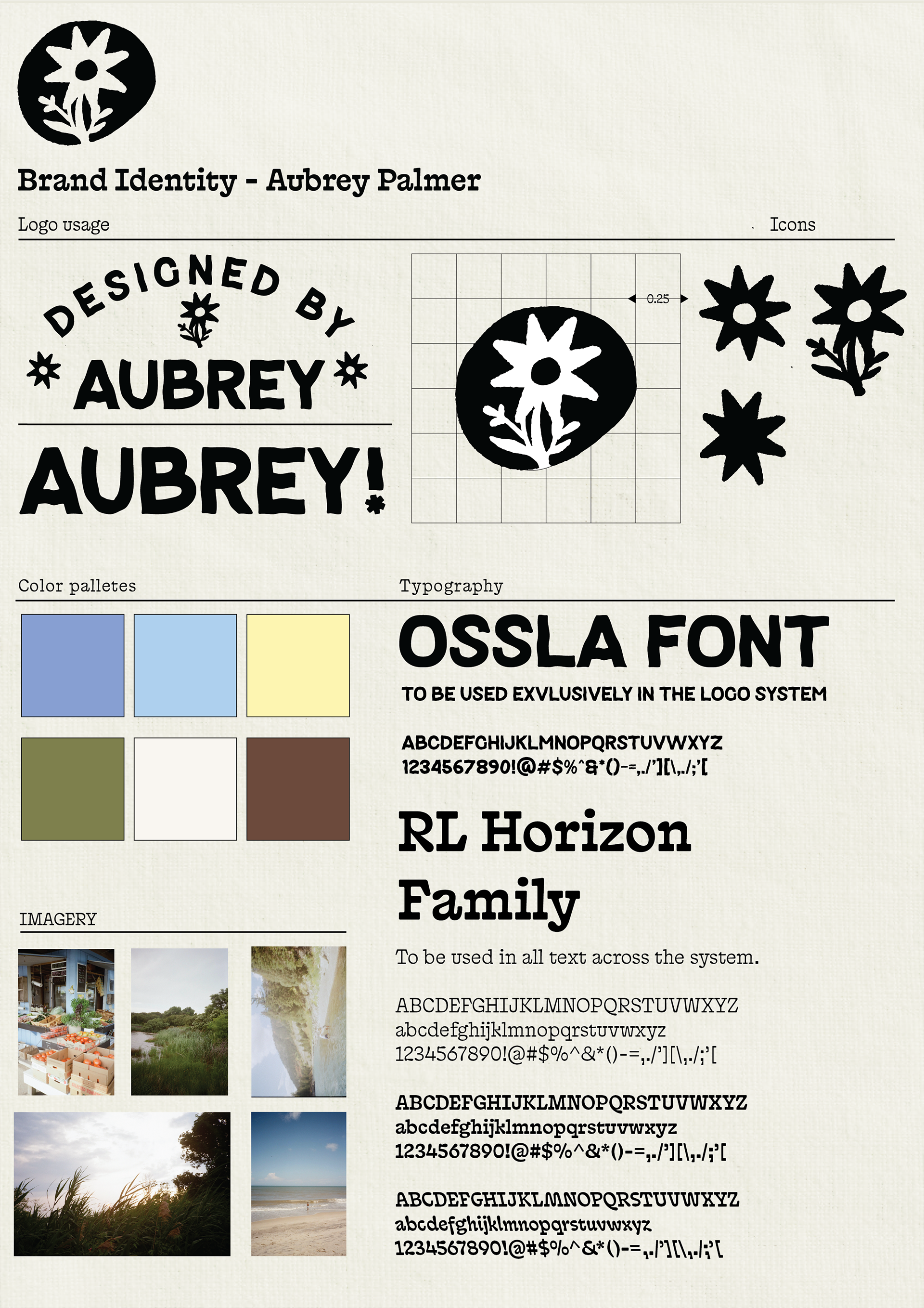
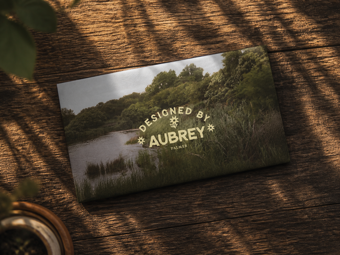
The logo uses imperfect type, simple floral symbols, and a soft curved layout to give the identity a more human and organic personality. The typography is organic, and playful. We wanted to go with a more "retro" timeless feel.
Business Cards
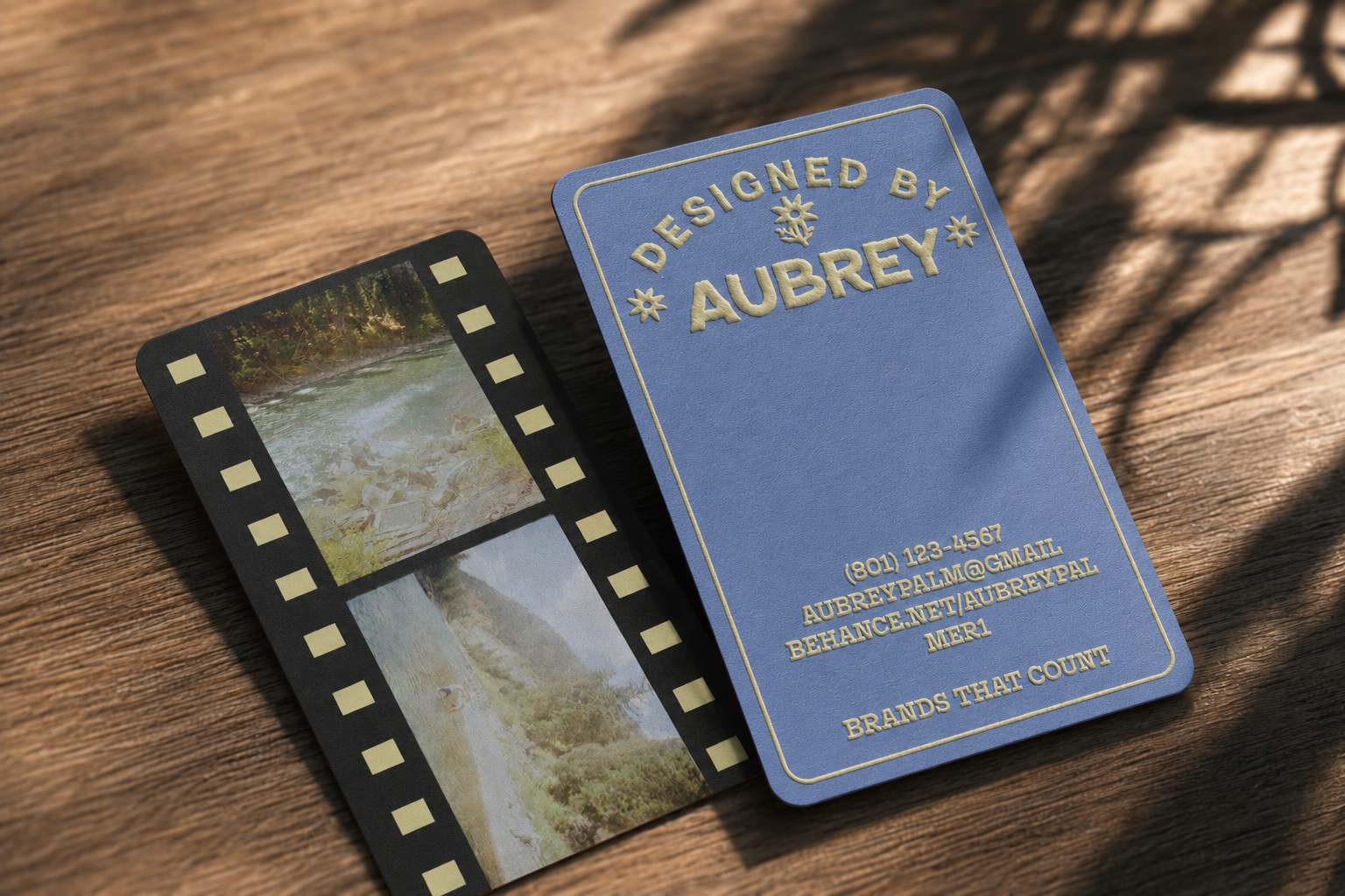
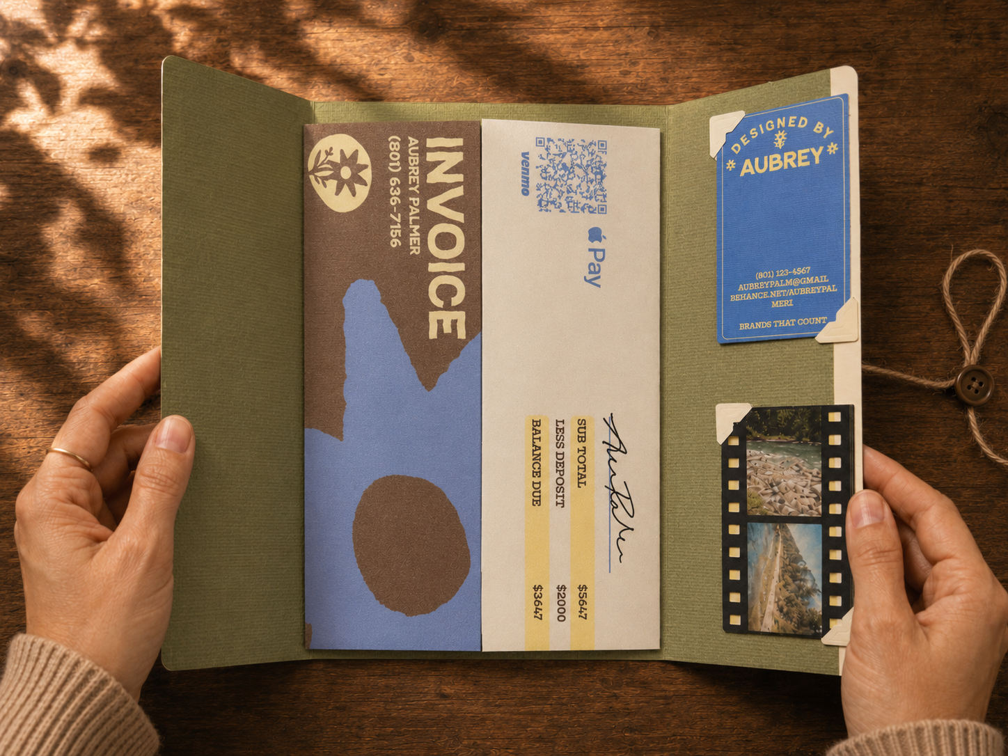
The business cards were designed as small tactile objects, with rounded corners, soft yellow type, and a textured blue paper feel. The back of the card uses a film-strip layout to connect the brand back to photography and process.
Envelope / mailer system
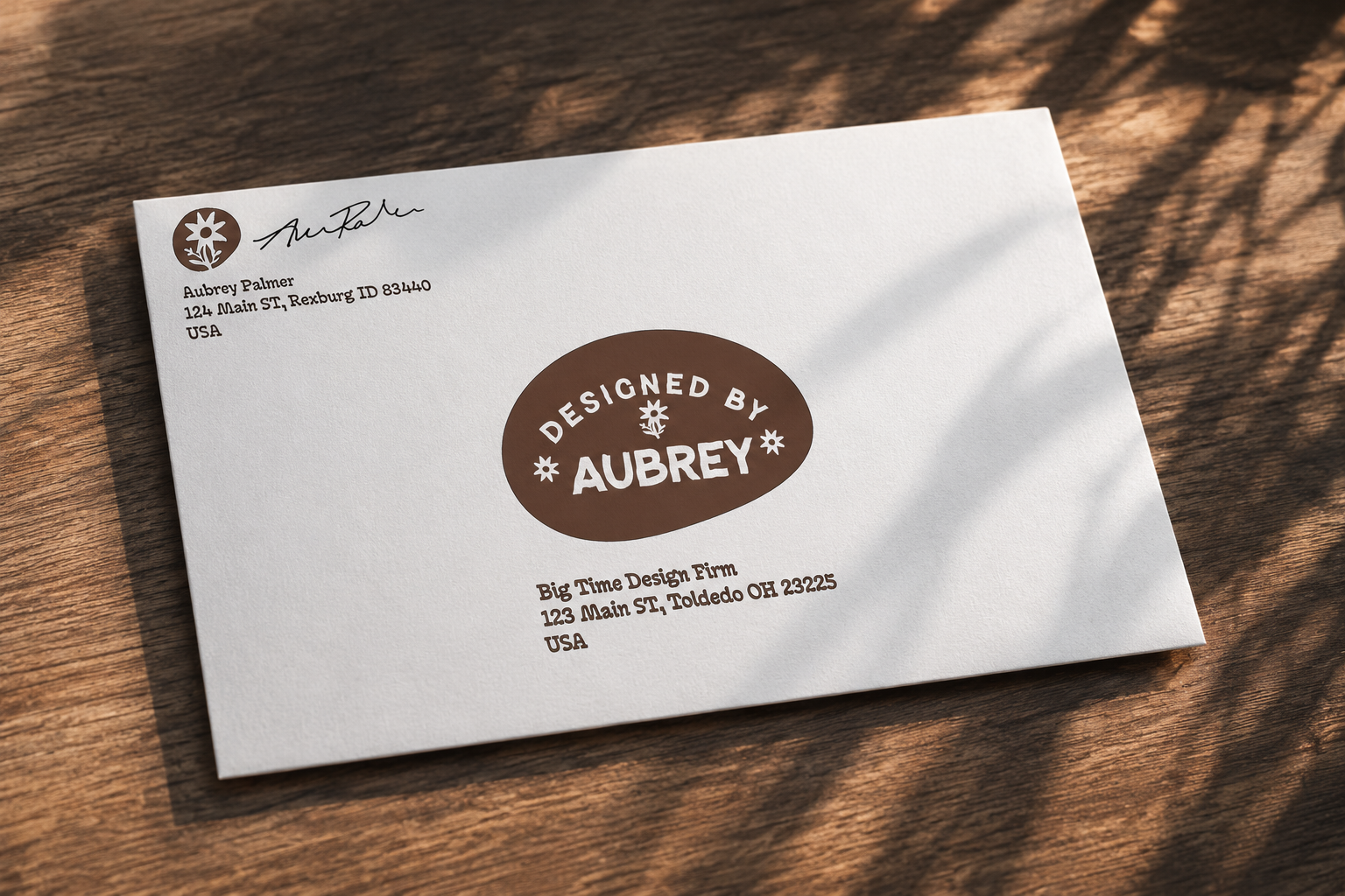
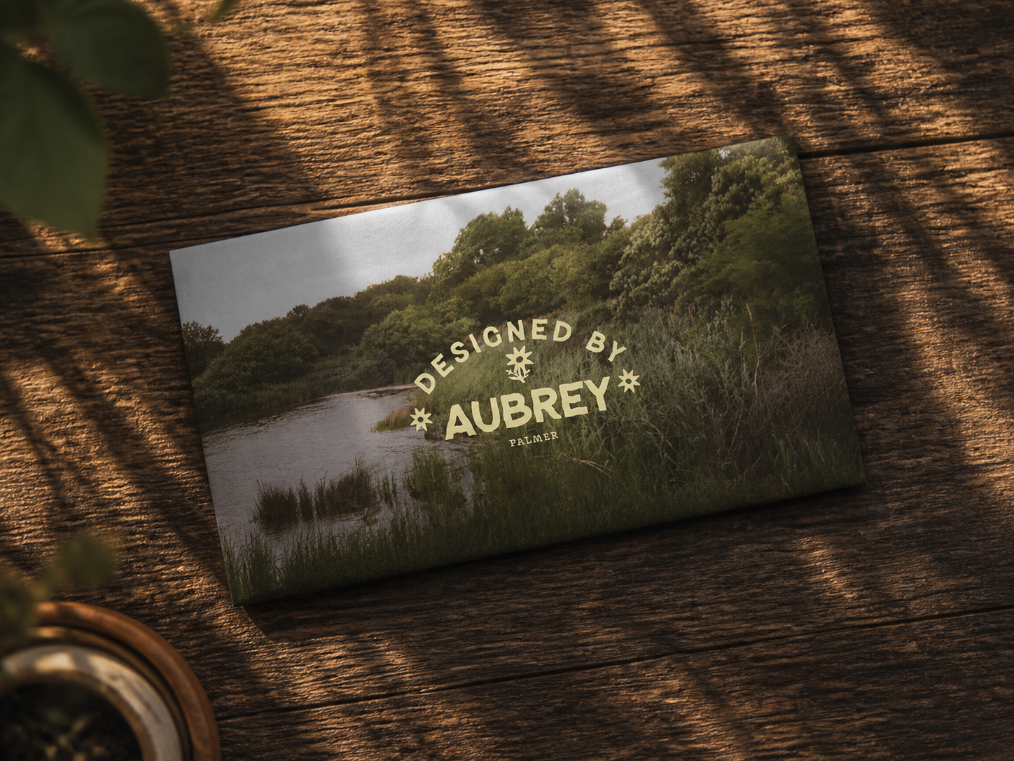
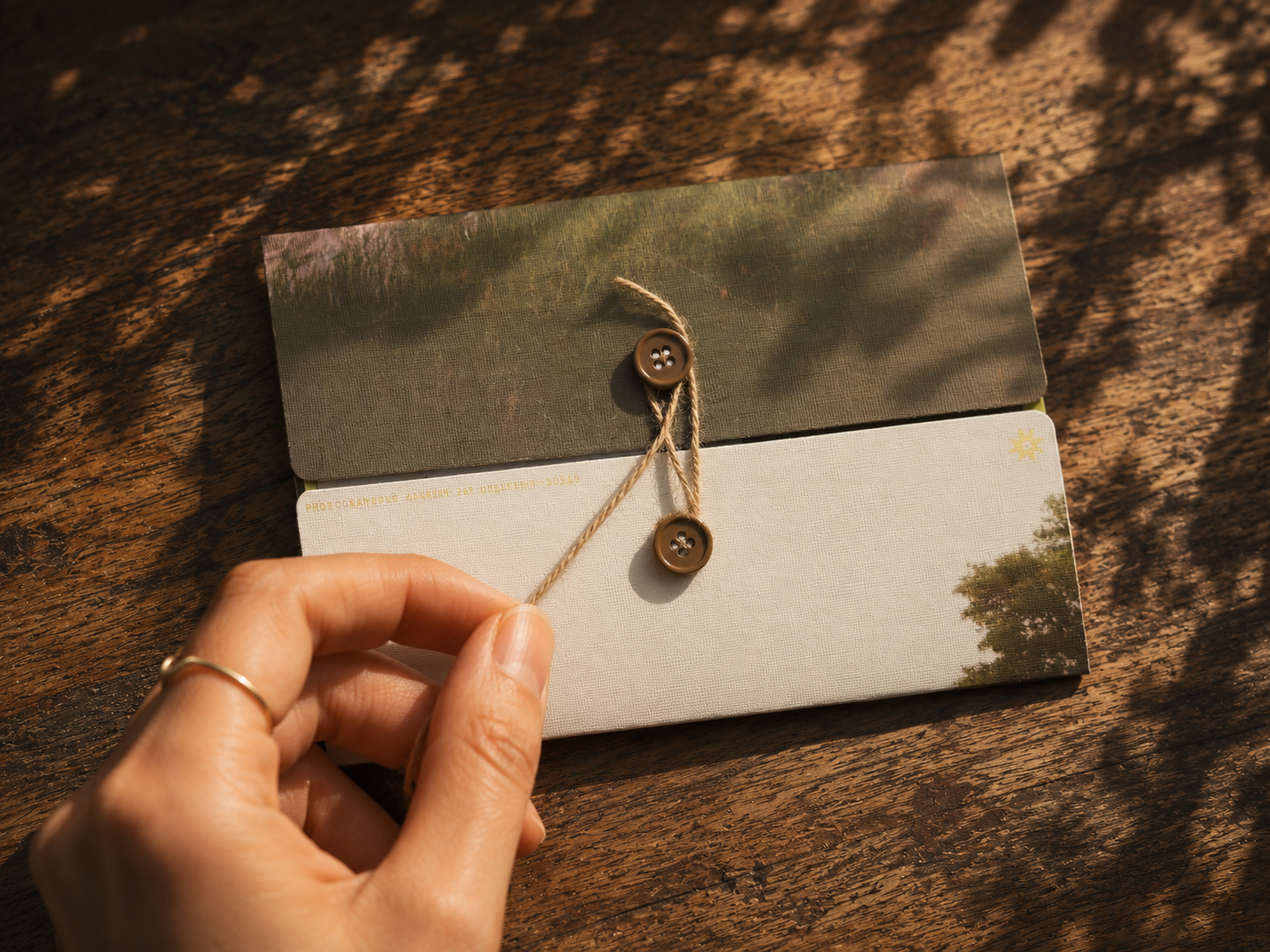
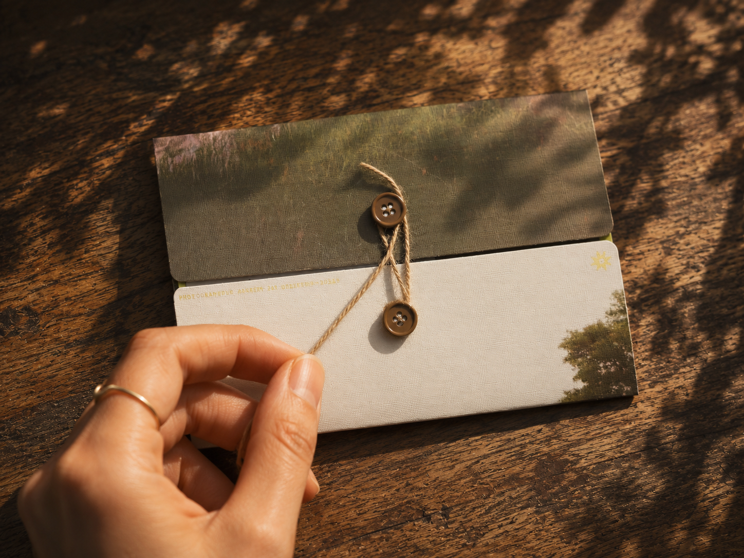
The envelope acts as both packaging and part of the brand experience. It folds into thirds and uses a string-and-button closure to make the process of opening it feel personal and handmade.
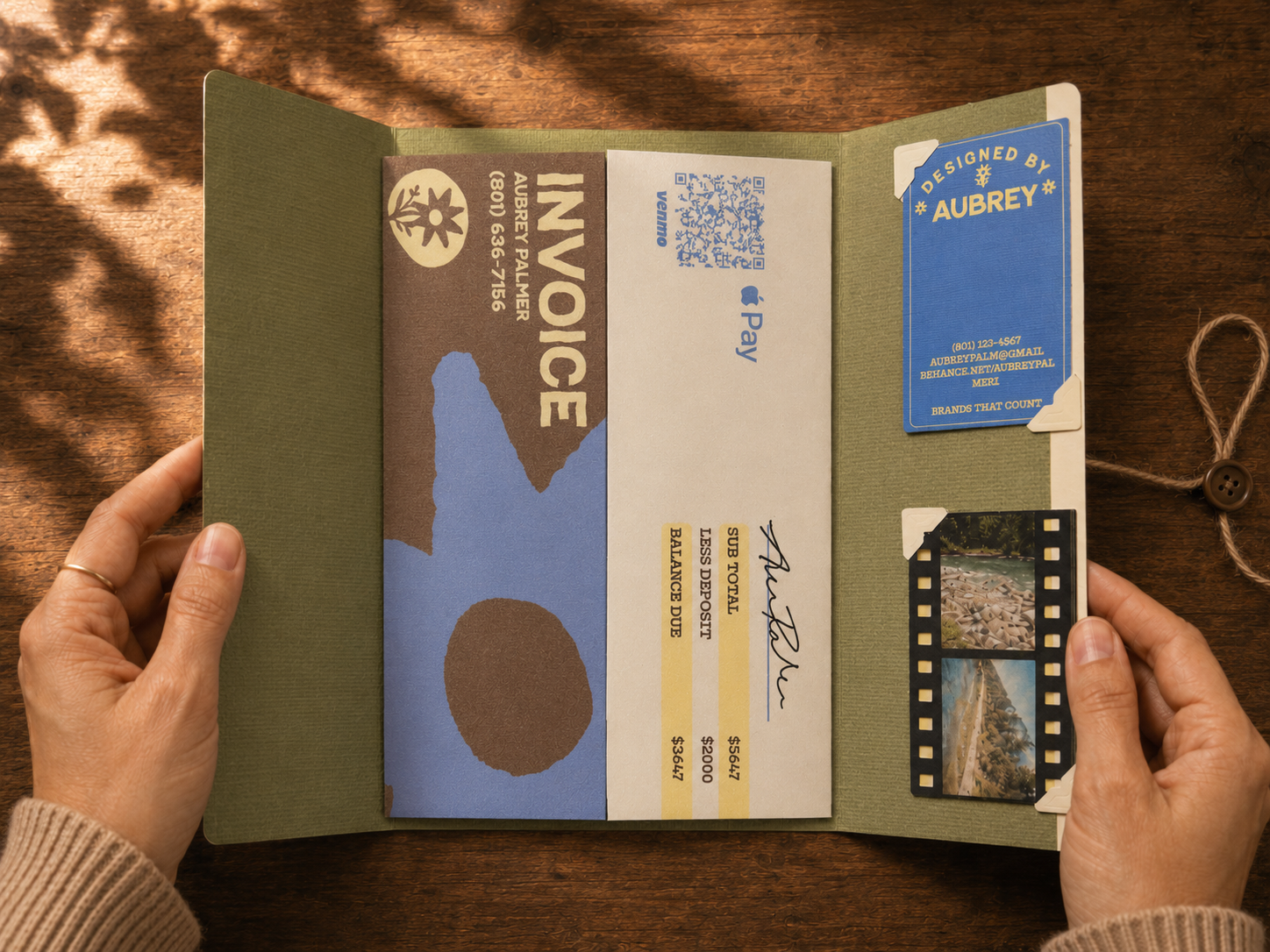
Enlarged to show detail.
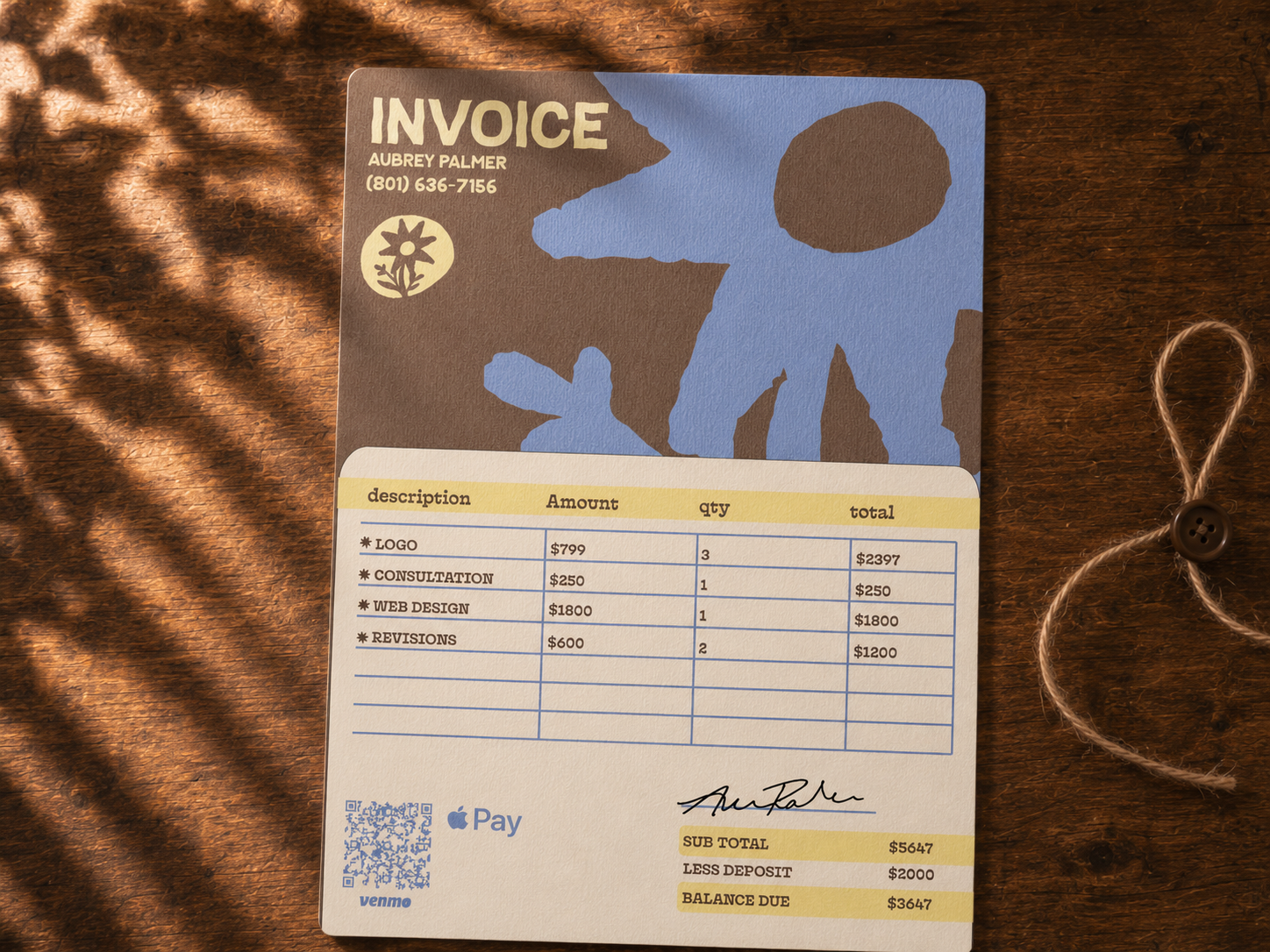
Inside, the client receives the invoice, payment details, business cards, arranged like a small branded kit.
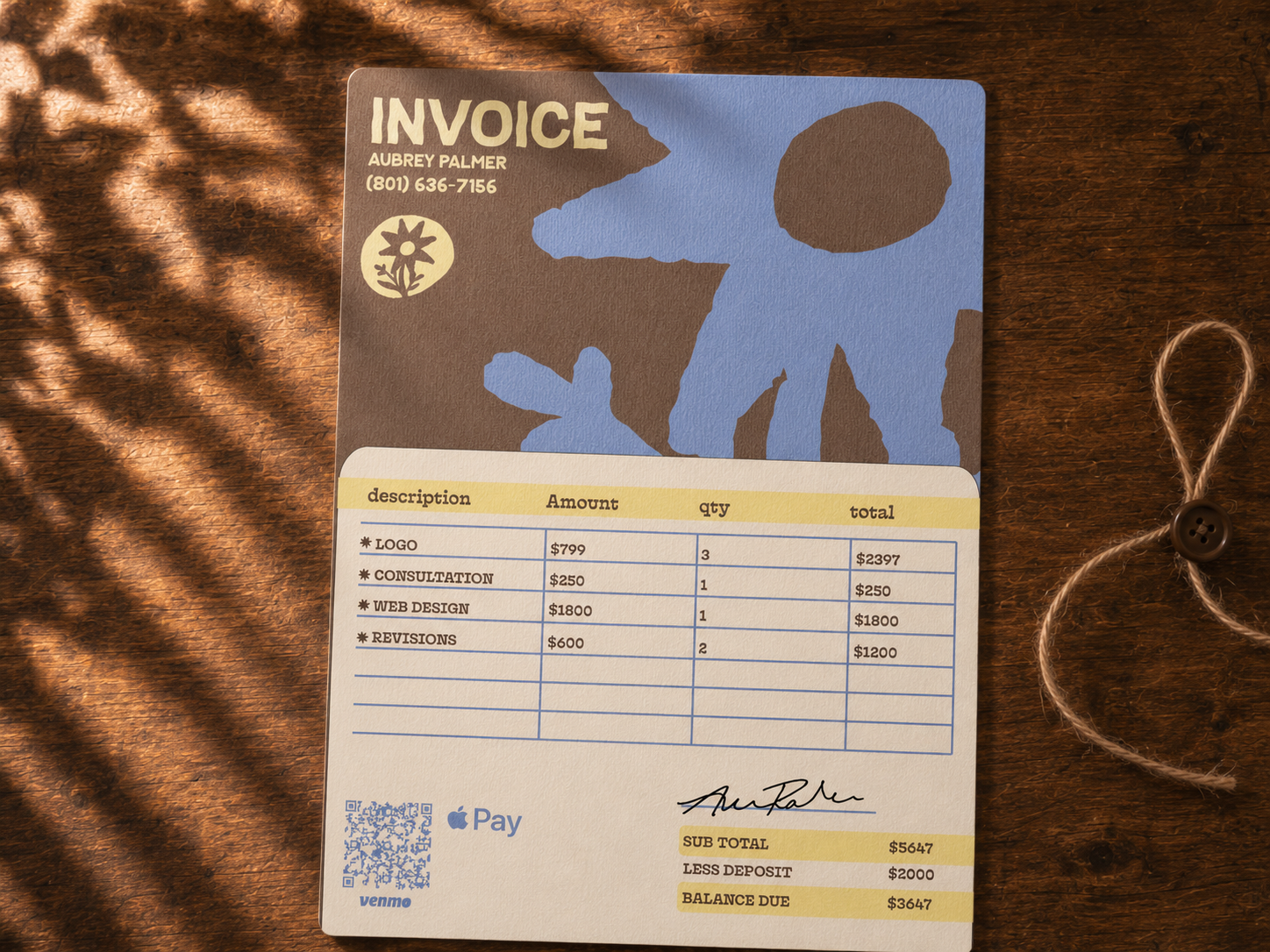
The invoice was designed to match the rest of the identity instead of feeling separate from it. Payment information, itemized services, and brand graphics are all built into one folded paper piece.
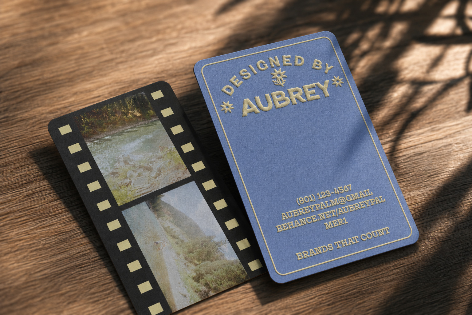
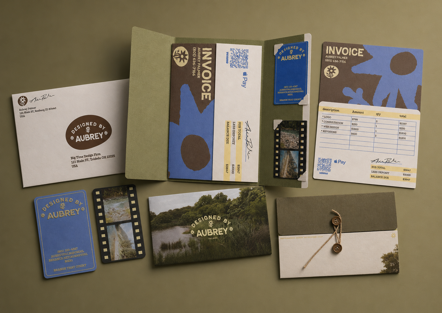
The system was designed to feel personal in use, whether mailed, opened, handed off, or kept.
A tactile identity system for a brand built beyond the logo.