
Project 4 - Gift Booklet
A typographic gift booklet designed to invite reflection, readability, and care through hierarchy and pacing.
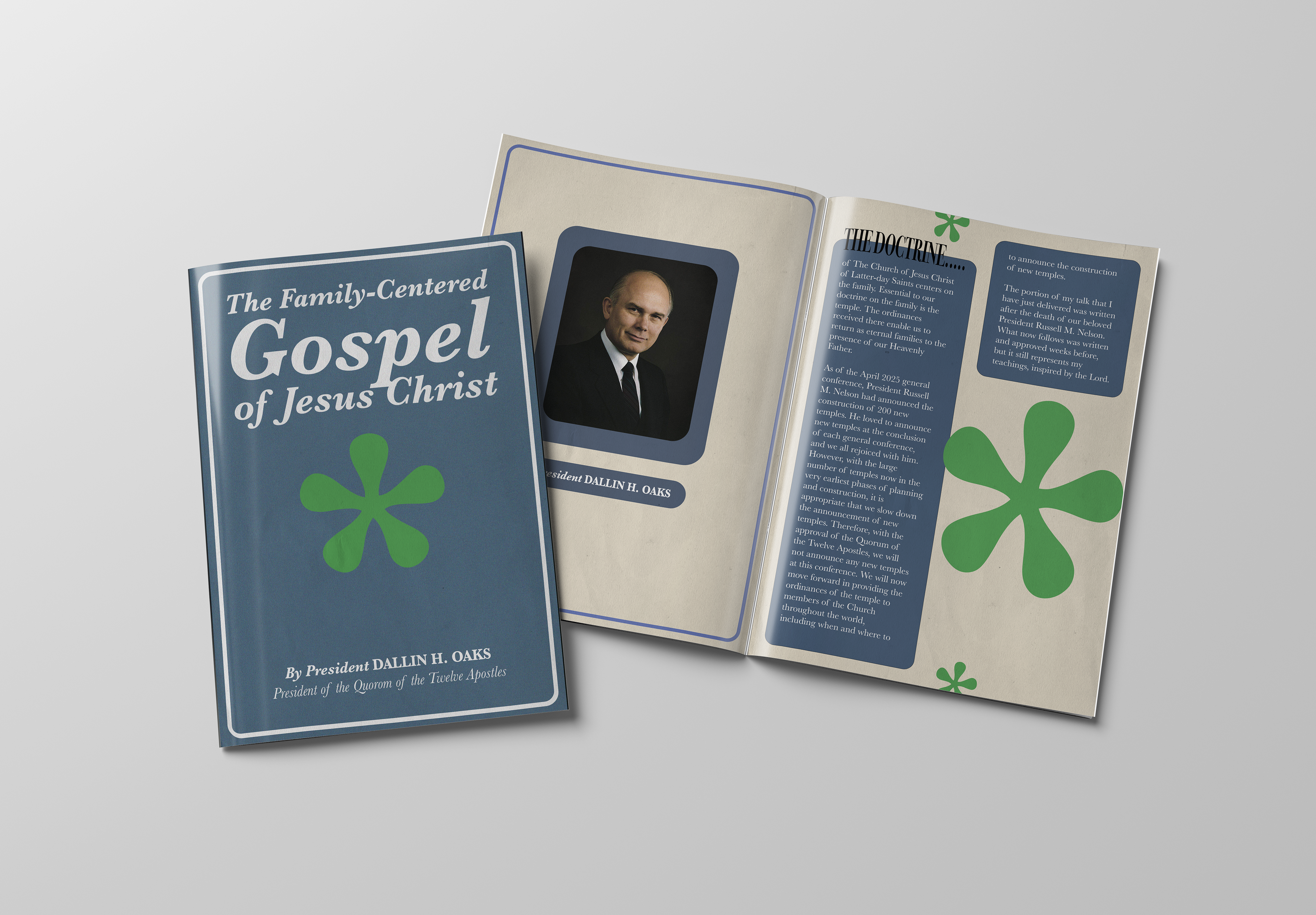
Project Overview-
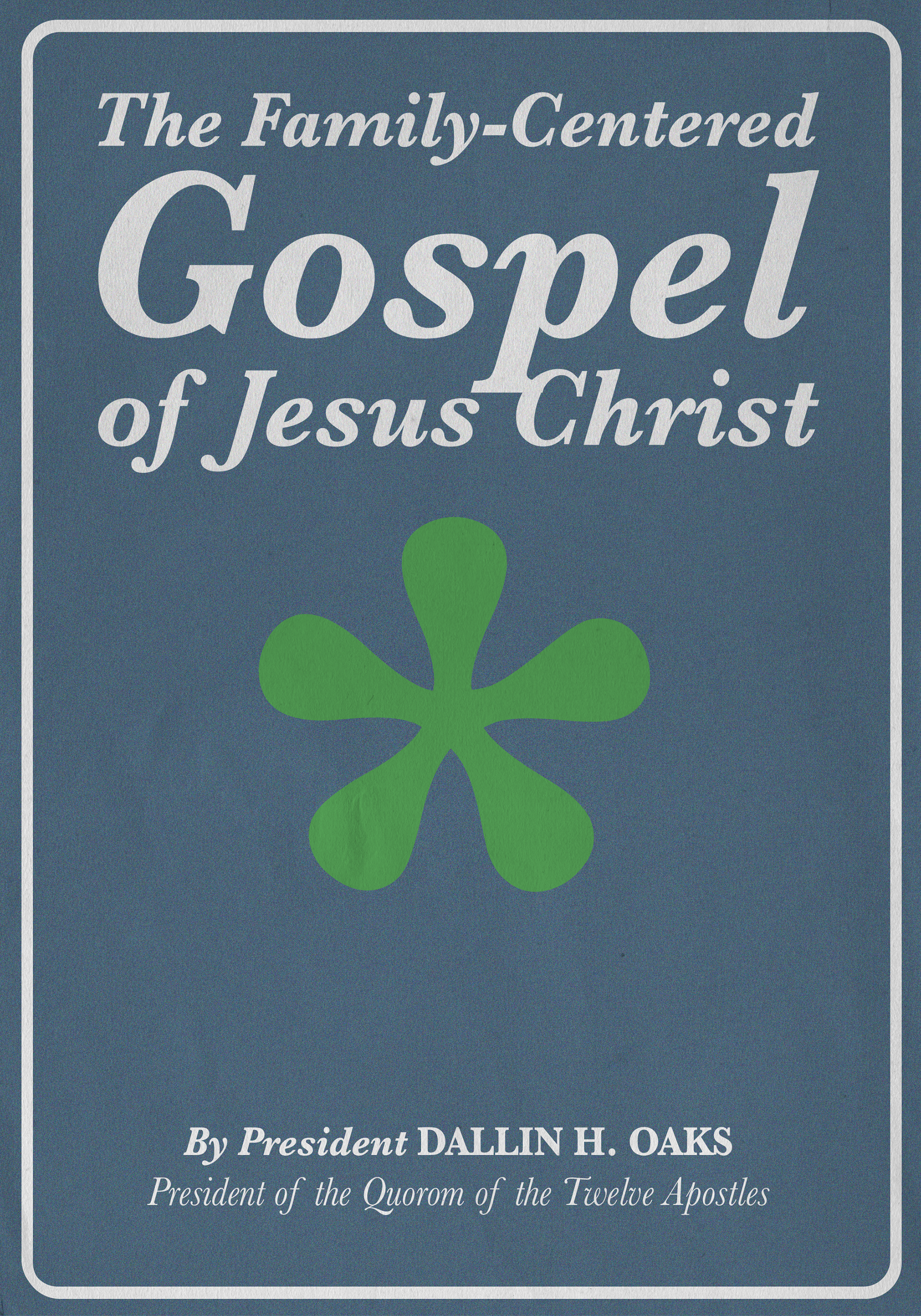
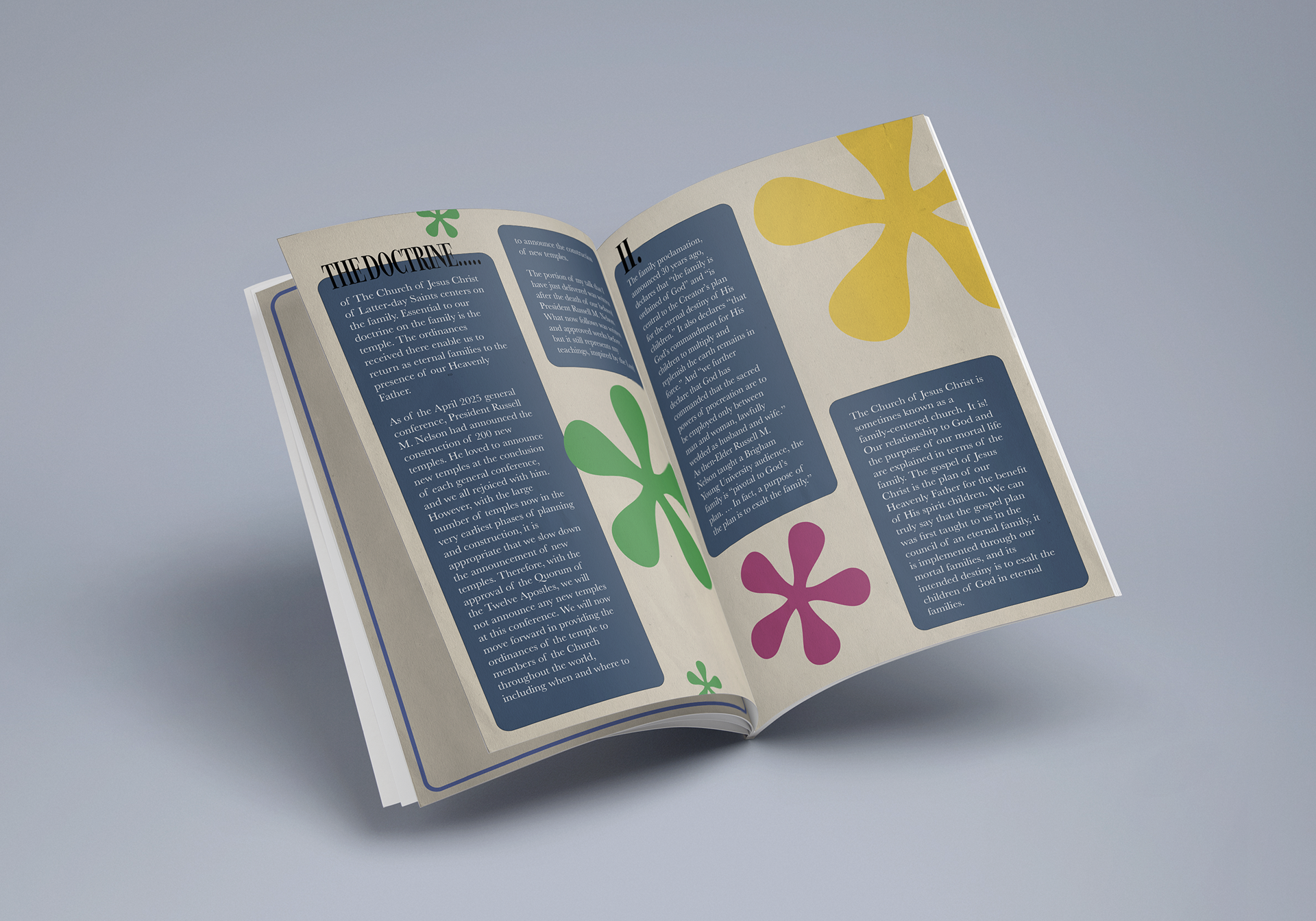
This project was designed as a typographic gift booklet using a talk from the most recent General Conference. The goal was to create a piece that feels personal and worth giving one that invites the reader to slow down, reflect, and engage with the message through thoughtful typographic hierarchy and pacing. I chose The Family-Centered Gospel of Jesus Christ, by President Dallin H. Oaks. I actually saw this talk live with my wife, so this talk is very special to me.
The Intent: Designing a Gift
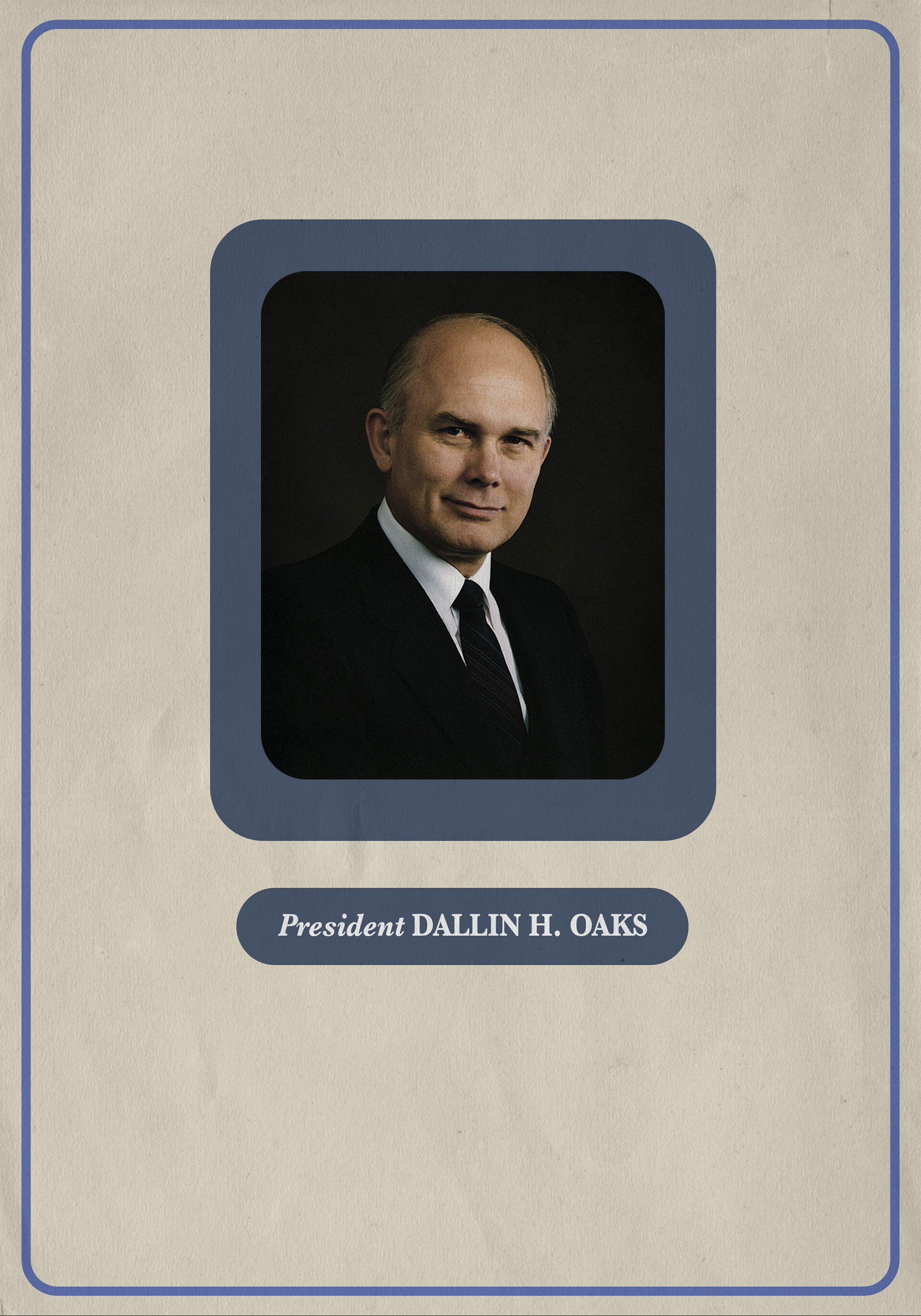
Unlike traditional editorial layouts, this booklet was designed as a gift for someone I care about. Every typographic decision was made with the reader in mind—prioritizing warmth, clarity, and flow. The design avoids decoration and instead uses typography as a form of visual punctuation to guide the reader through moments of emphasis, pause, and reflection.
Audience
The intended audience for this booklet is someone seeking reassurance and spiritual grounding. The design encourages quiet reading and skimming alike, allowing the reader to engage deeply or briefly depending on their needs.
Typography as Visual Punctuation
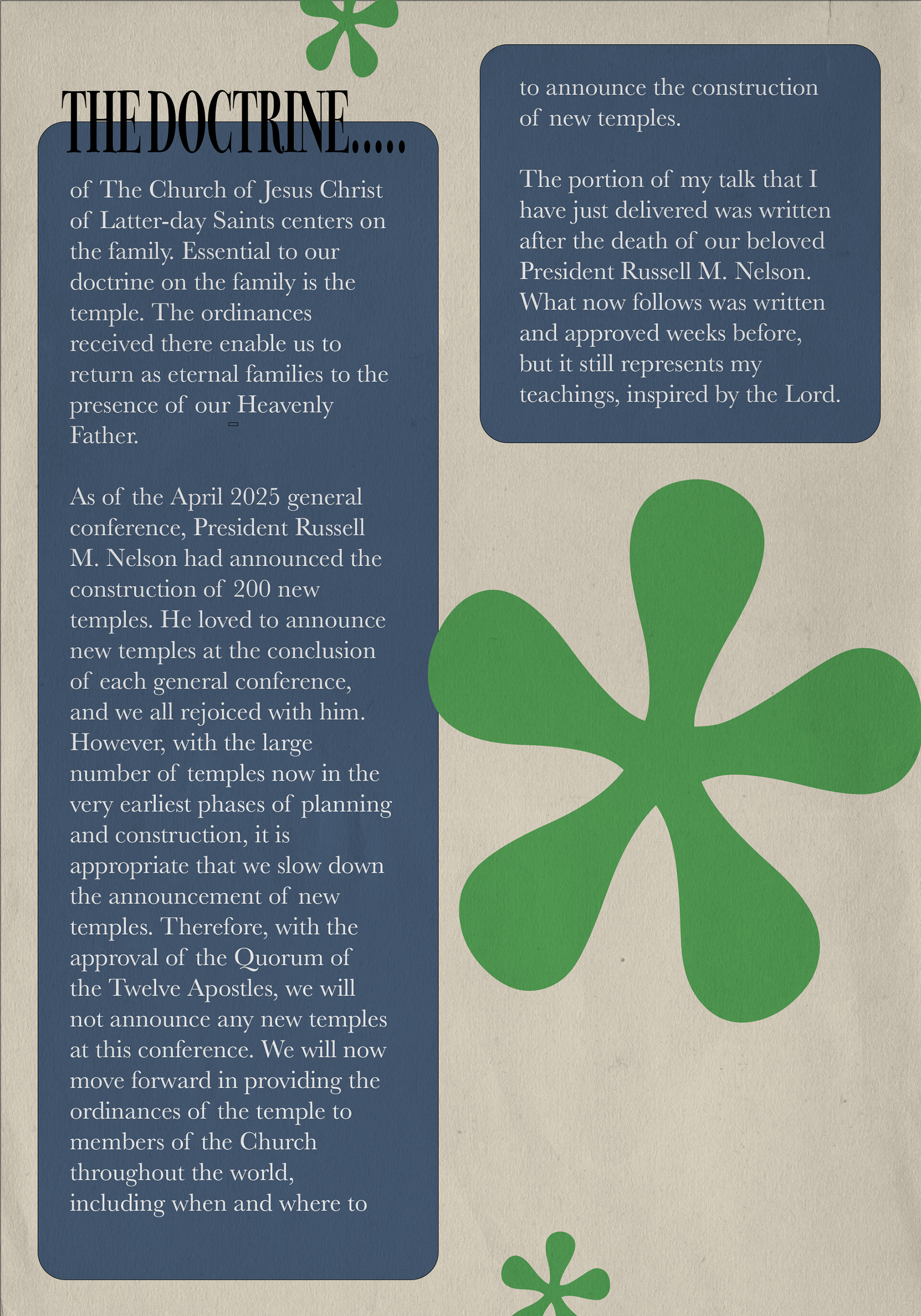
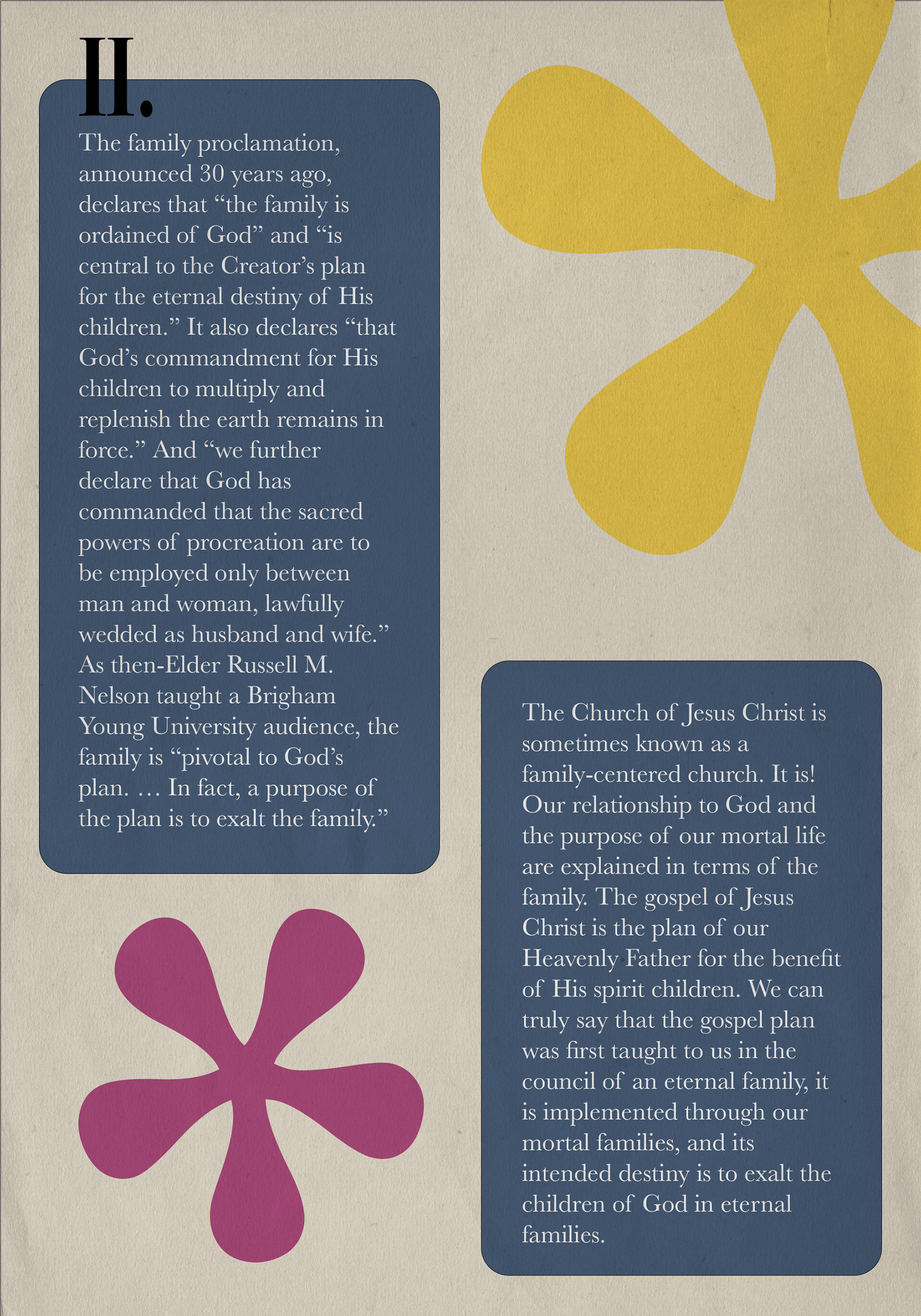
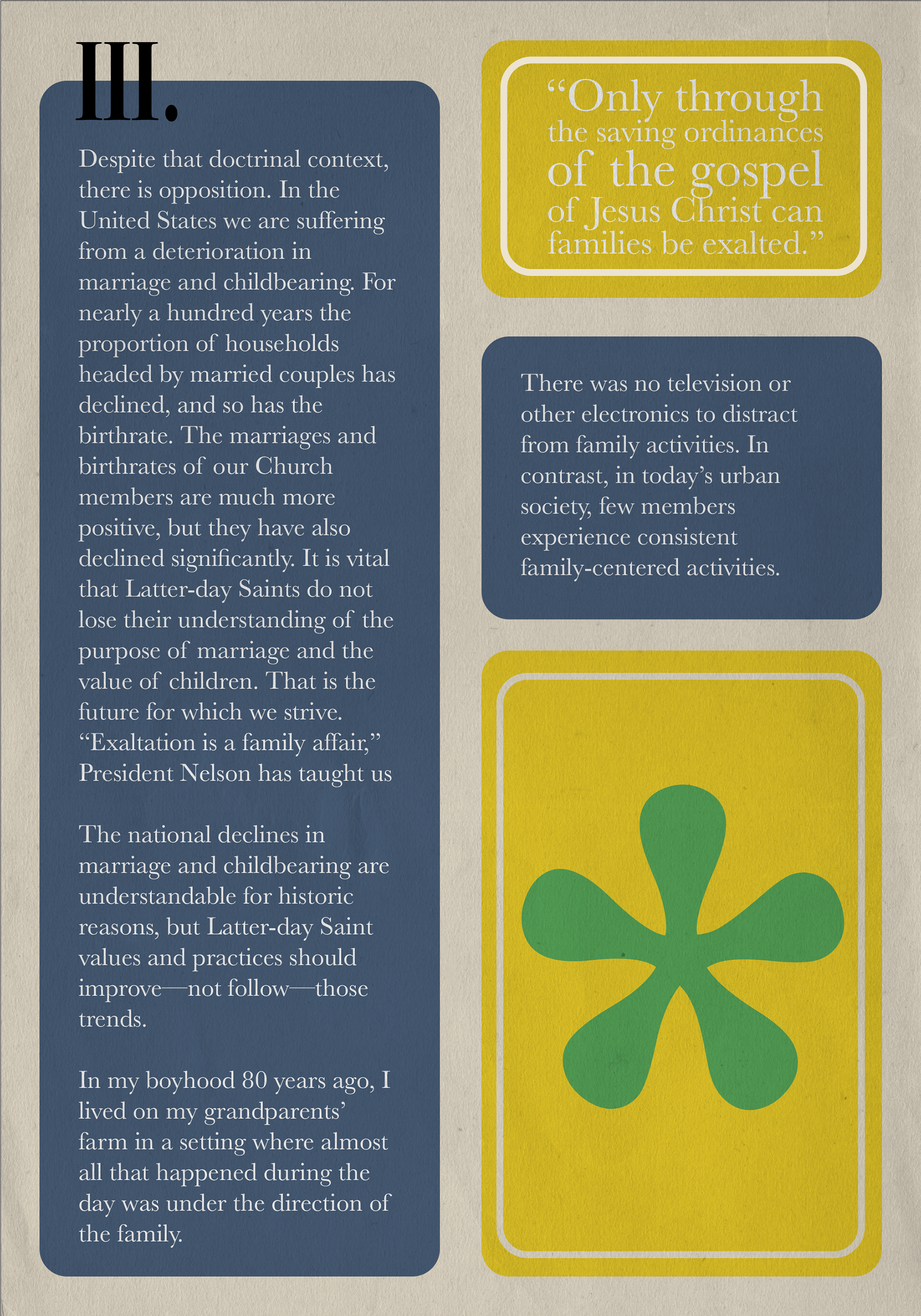
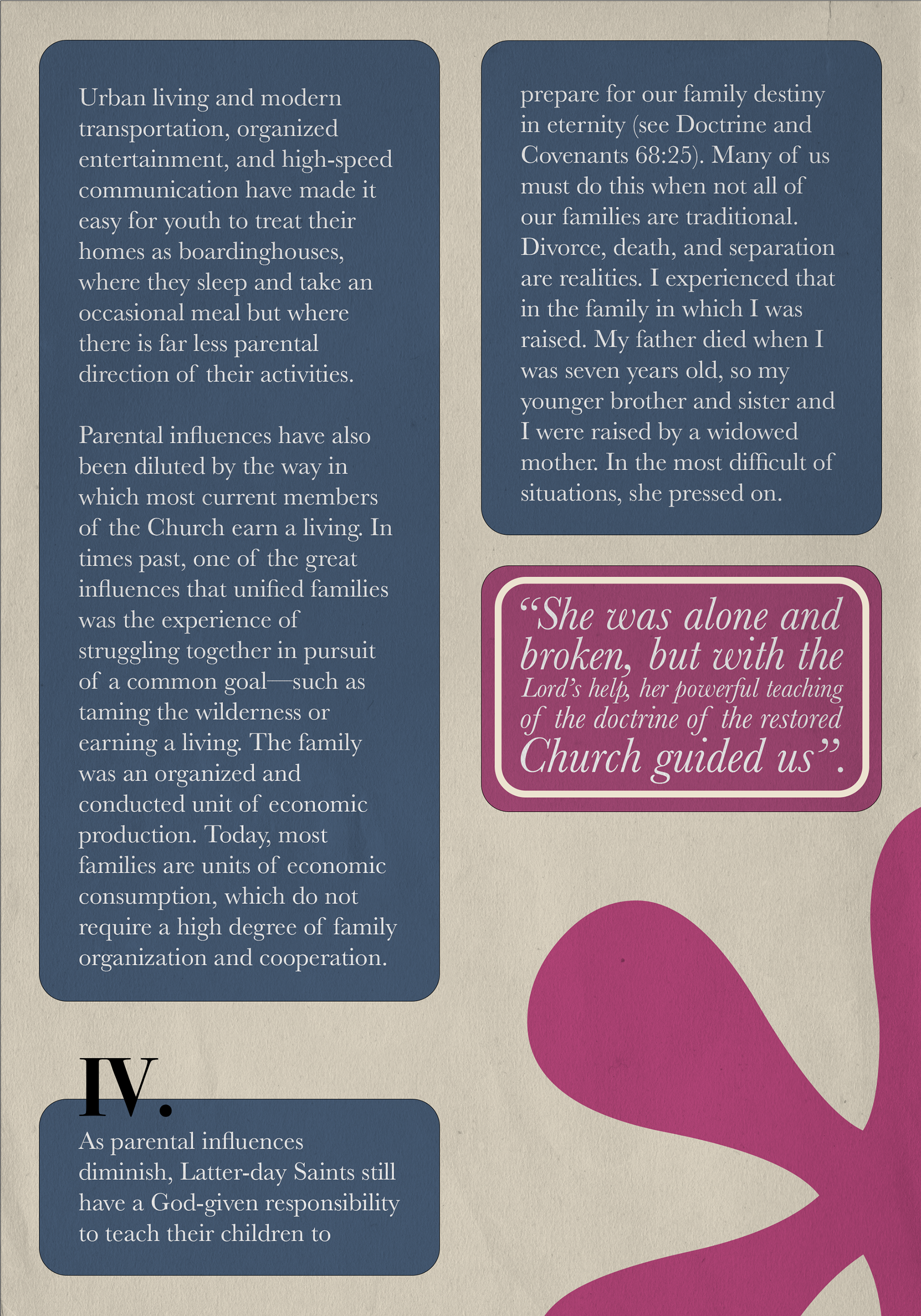
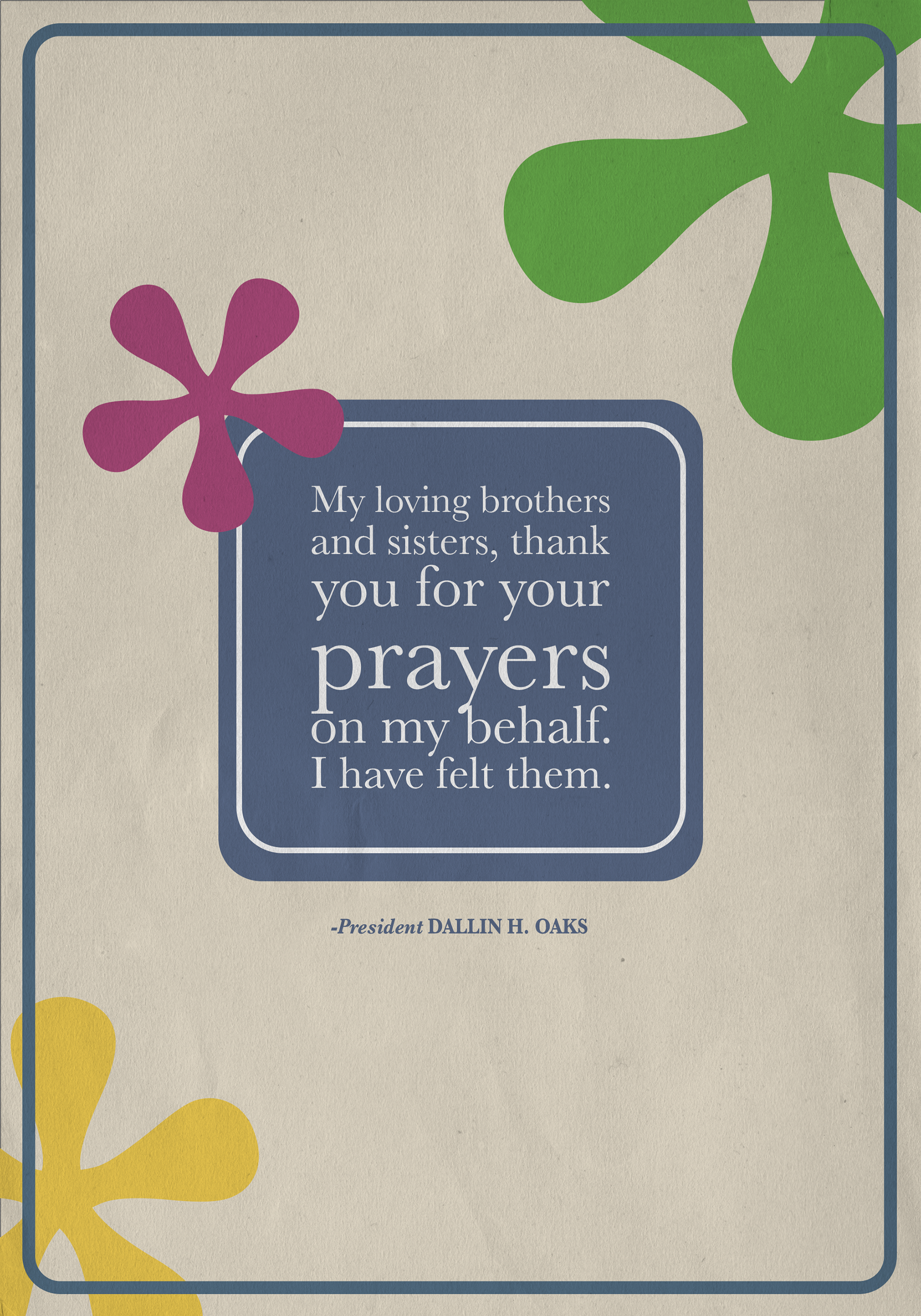
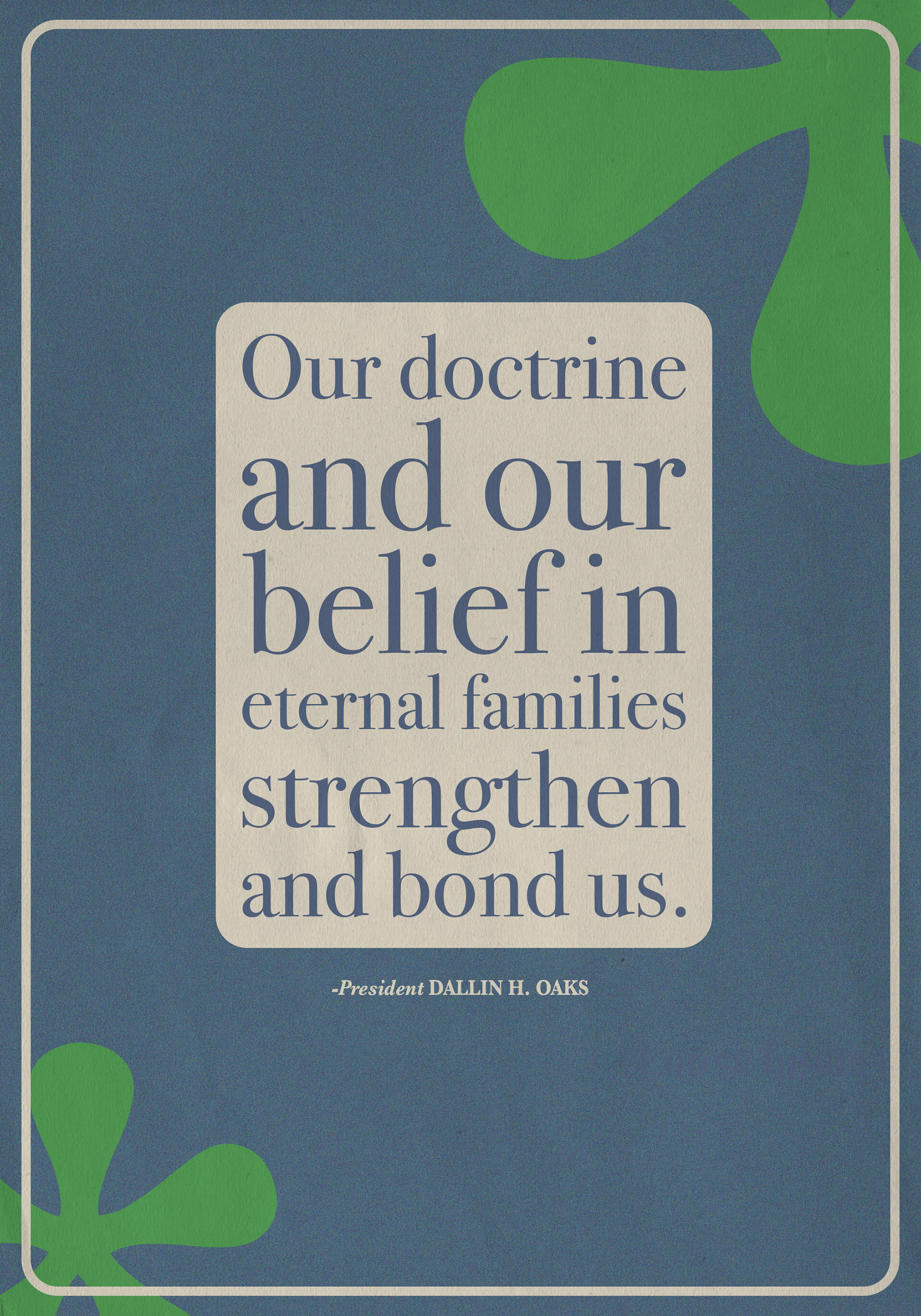
Typography in this project acts as visual punctuation. Changes in scale, weight, spacing, and alignment signal where to pause, where to focus, and when to move forward. Hierarchy was used not only to organize information, but to invite continued reading without overwhelming the reader.
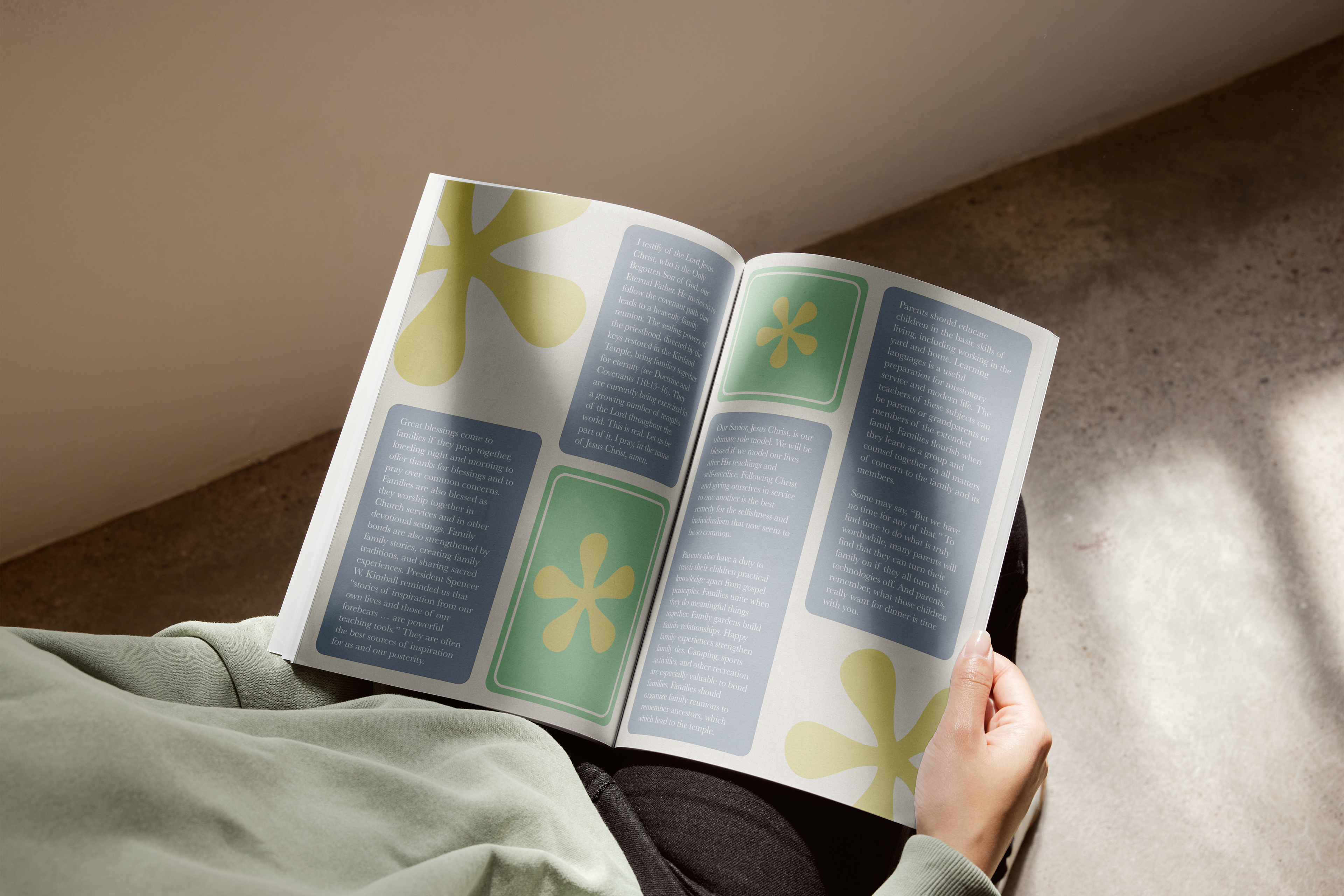
Typographic System
The typographic system balances clarity and expression. Headlines create entry points into the text, while body copy is set for extended readability. Captions and notes were intentionally subtle to avoid disrupting the reading experience. My primary typeface was Baskerville, and my secondary was Bodoni.
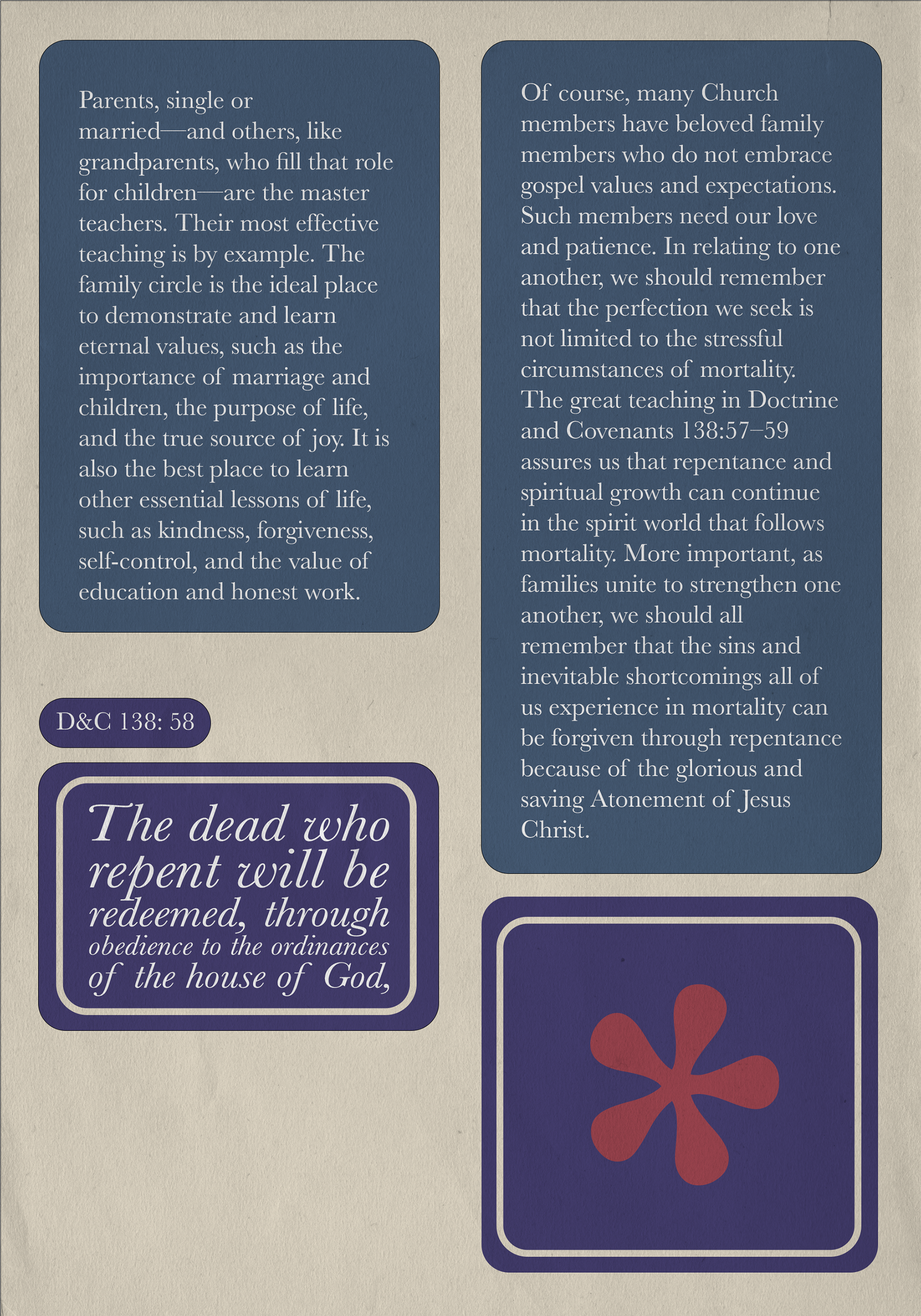
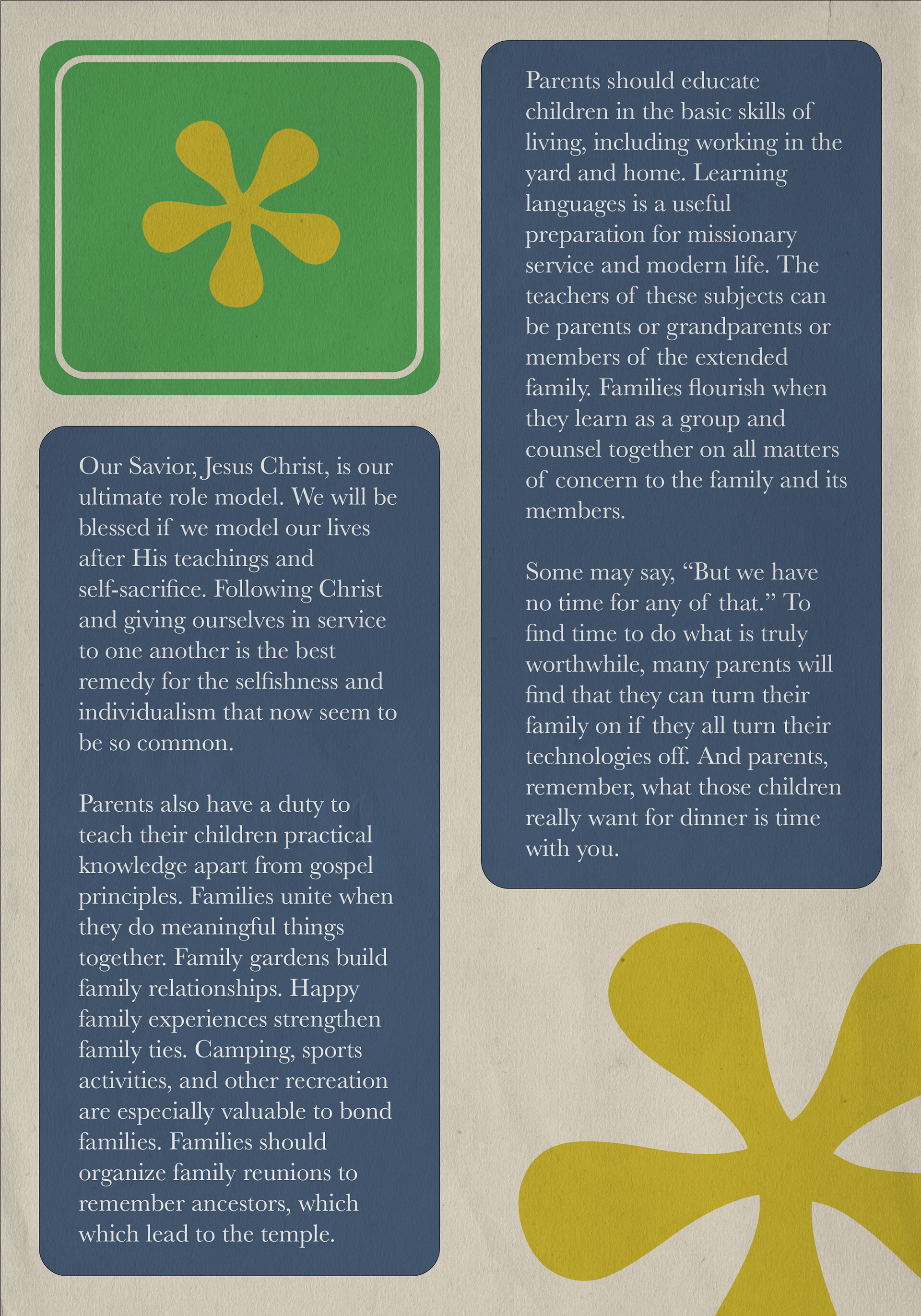
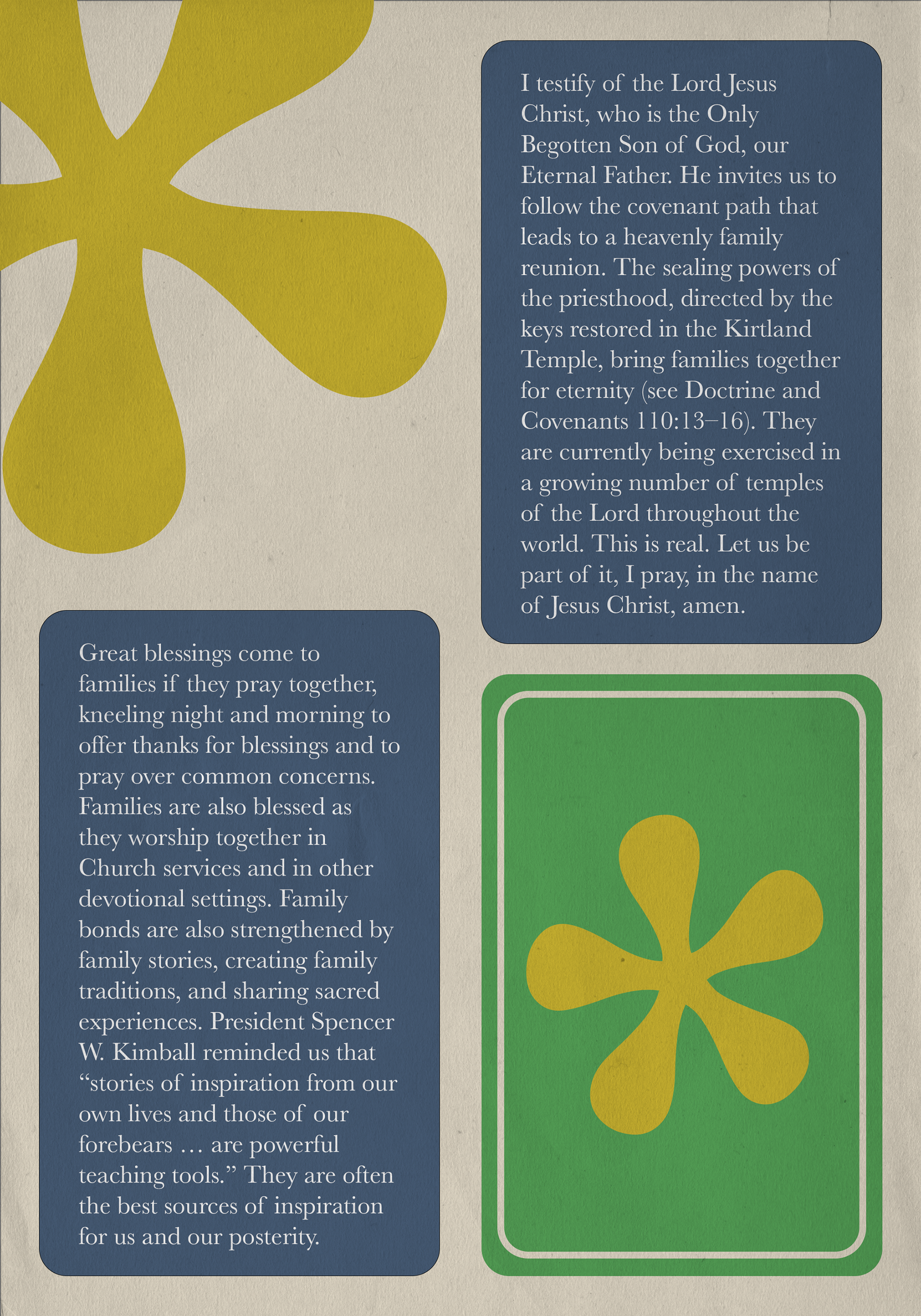
Hierarchy & Pacing Across Spreads
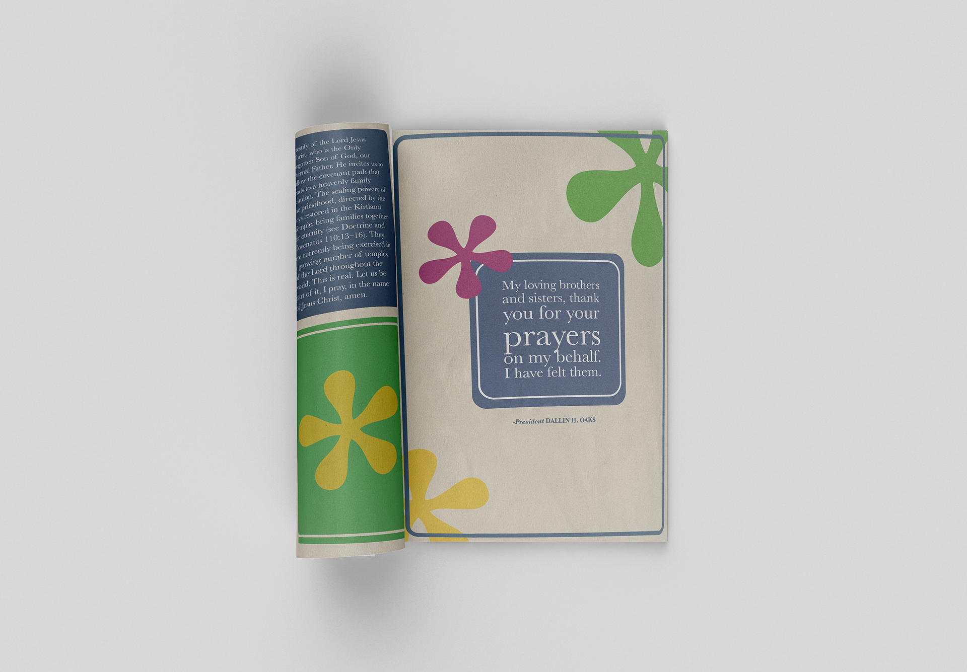
Each spread was designed to feel related but not repetitive. Variations in hierarchy, spacing, and emphasis create pacing across the booklet, helping maintain interest while preserving a cohesive visual family.
Color & Material Choices
A limited color palette was chosen to support the tone of the talk while maintaining readability. The contrast between the cover and interior pages reinforces the idea of the booklet as a thoughtful, physical gift. I was also inspired by early Ensign magazines and retro color palletes.
Tools Used
For this project I mostly used, InDesign, Photoshop, Fonts.com, Grid based layouts, and Typography Systems.

Reflection
This project strengthened my understanding of typographic hierarchy, grid systems, and readability over time. Designing for a specific person challenged me to be more intentional with every typographic choice, reinforcing that good typography serves the reader before the designer.
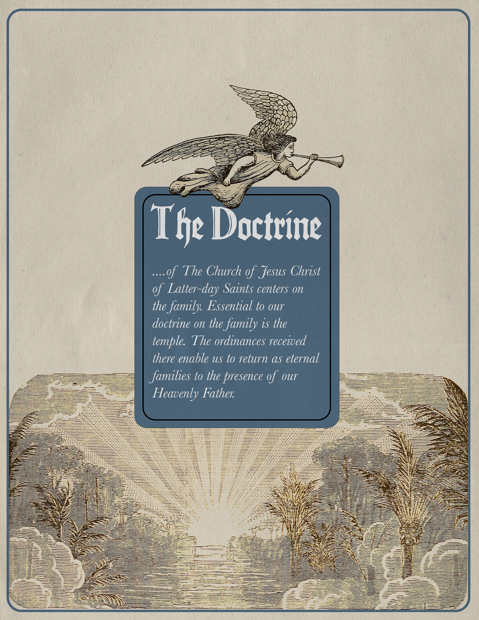
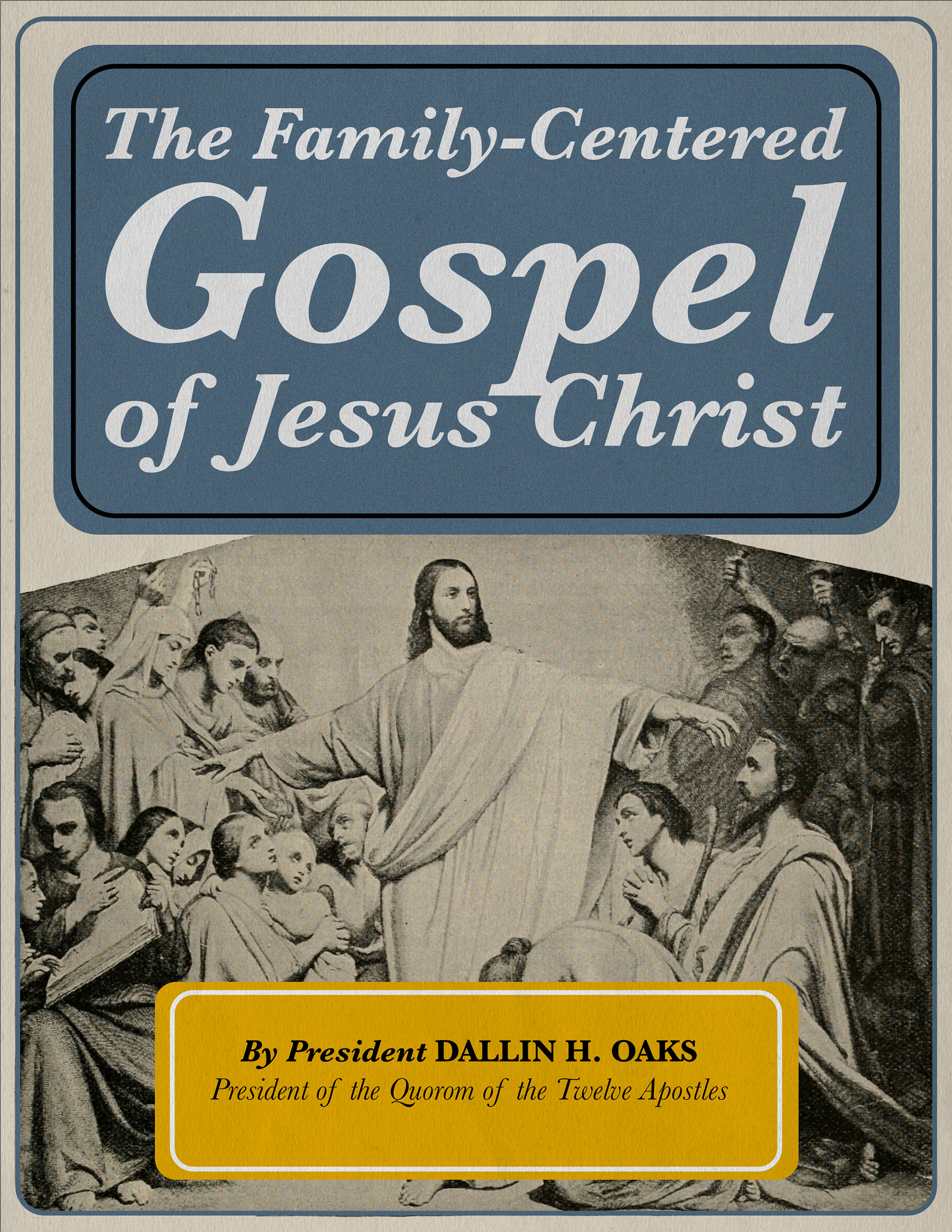
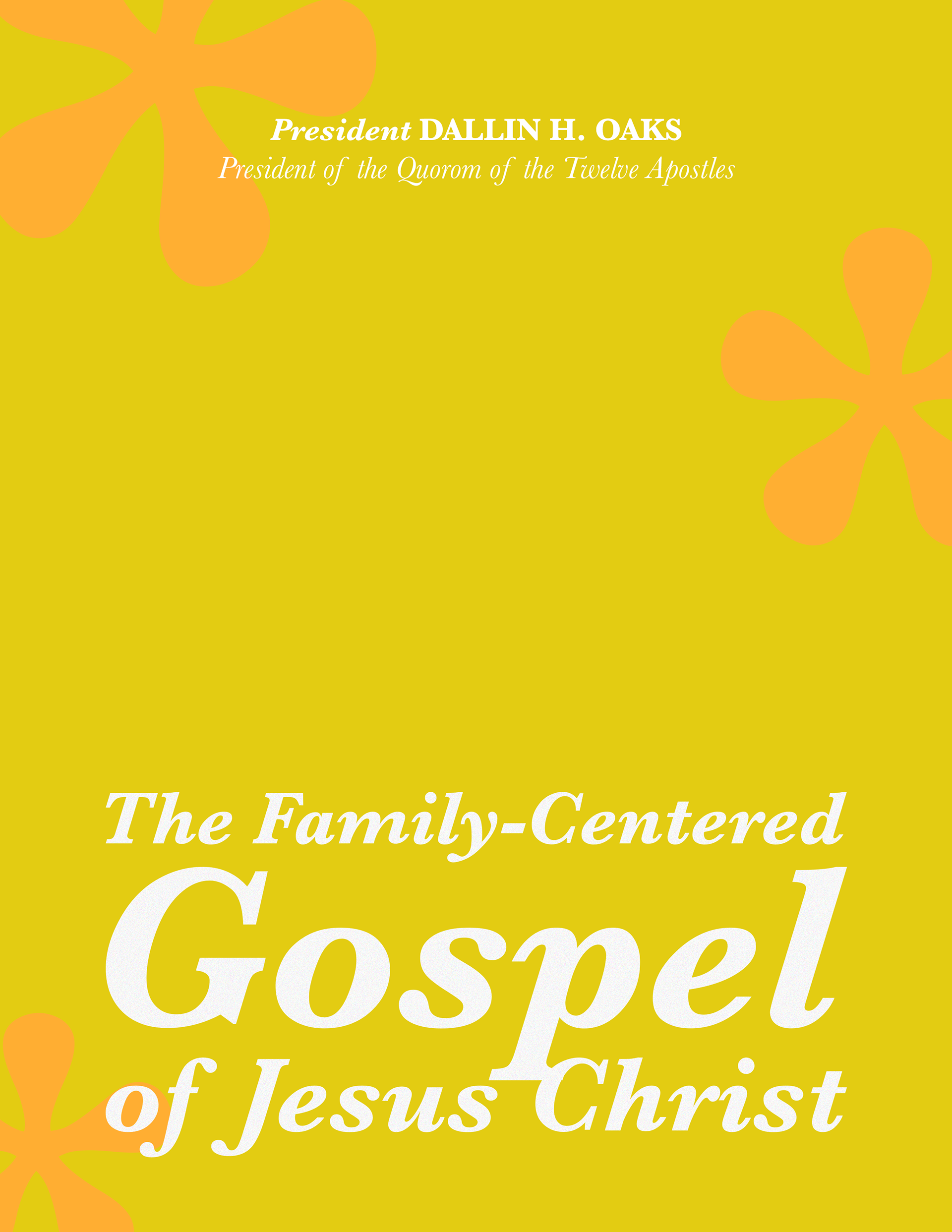
Fun experiments, but not the final design.